 Zhanna Cherneichuk
EdTech · B2B SaaS
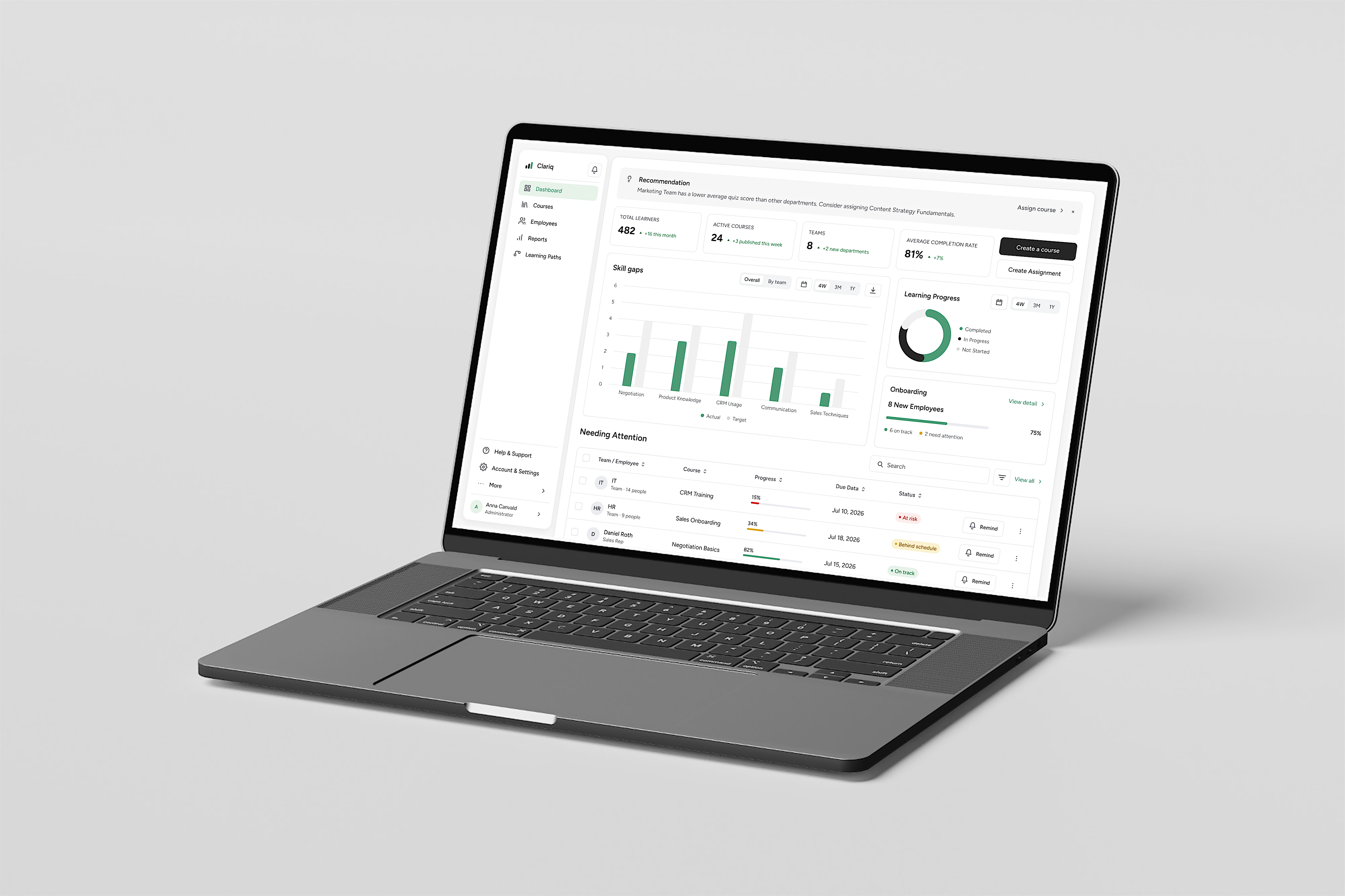
Clariq gives the admin or manager who runs company learning one place to create, assign and track employee training across teams — instead of scattering it across tools.


Who it's for
Companies that want to pull scattered learning into one place, see who's actually learning, and understand where skills are missing.
What I did
The full cycle, solo — research, MVP, flows, IA, hi-fi wireframes, usability testing with 5 users, and the final UI and design system.
A platform that brings onboarding, courses and mandatory training into one place, tracks who completed what, and shows where skills are missing across the company.
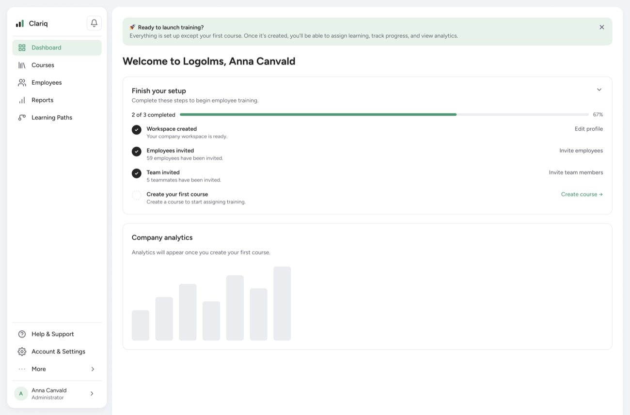
Admin / manager
Runs company learning — creates courses, assigns them, tracks progress and skill gaps.
Team lead
Sees their own team's progress and where it's falling behind.
Employee
Completes onboarding and whatever's assigned to them.
Chaotic management — onboarding, materials and courses are scattered across different systems (Docs, Notion, video).
No transparency or control — the company can't see who finishes, who's behind, which teams score lowest, or which topics cause trouble.
No view of skills — no sense of which skills are missing, who's ready for promotion, or which courses bring the most value, so learning is generic and resources are wasted.
One place with a fast course builder — all learning assembled and run from a single platform.
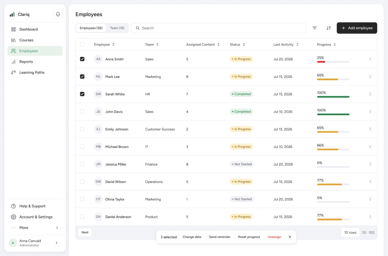
A progress dashboard — completion, laggards and weak spots across every team at a glance.
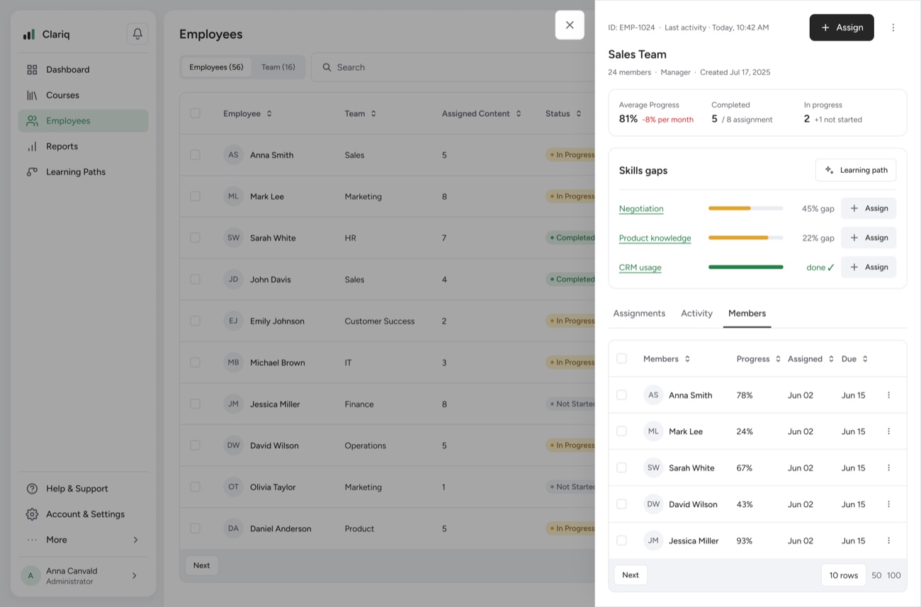
Skill Gap Analytics — missing skills, promotion readiness, and who needs which course next.
I ran the project on the Double Diamond and started with research: I pulled apart how competitors handle the three things a manager does most — creating a course, assigning it, and reading reports — swept a wider set of LMS products on Mobbin, and sense-checked against user reviews on Reddit and G2.
What I foundReviews are mixed, so I treated this as a sense-check, not proof:
TalentLMS
Recurring complaints — G2 · Capterra
Docebo
Recurring complaints — G2
So I kept nothing visual from them. I borrowed clean composition patterns from Podia (course builder, confirm dialogs, Public/Hidden) — but not its color or gradients.
What users said — G2
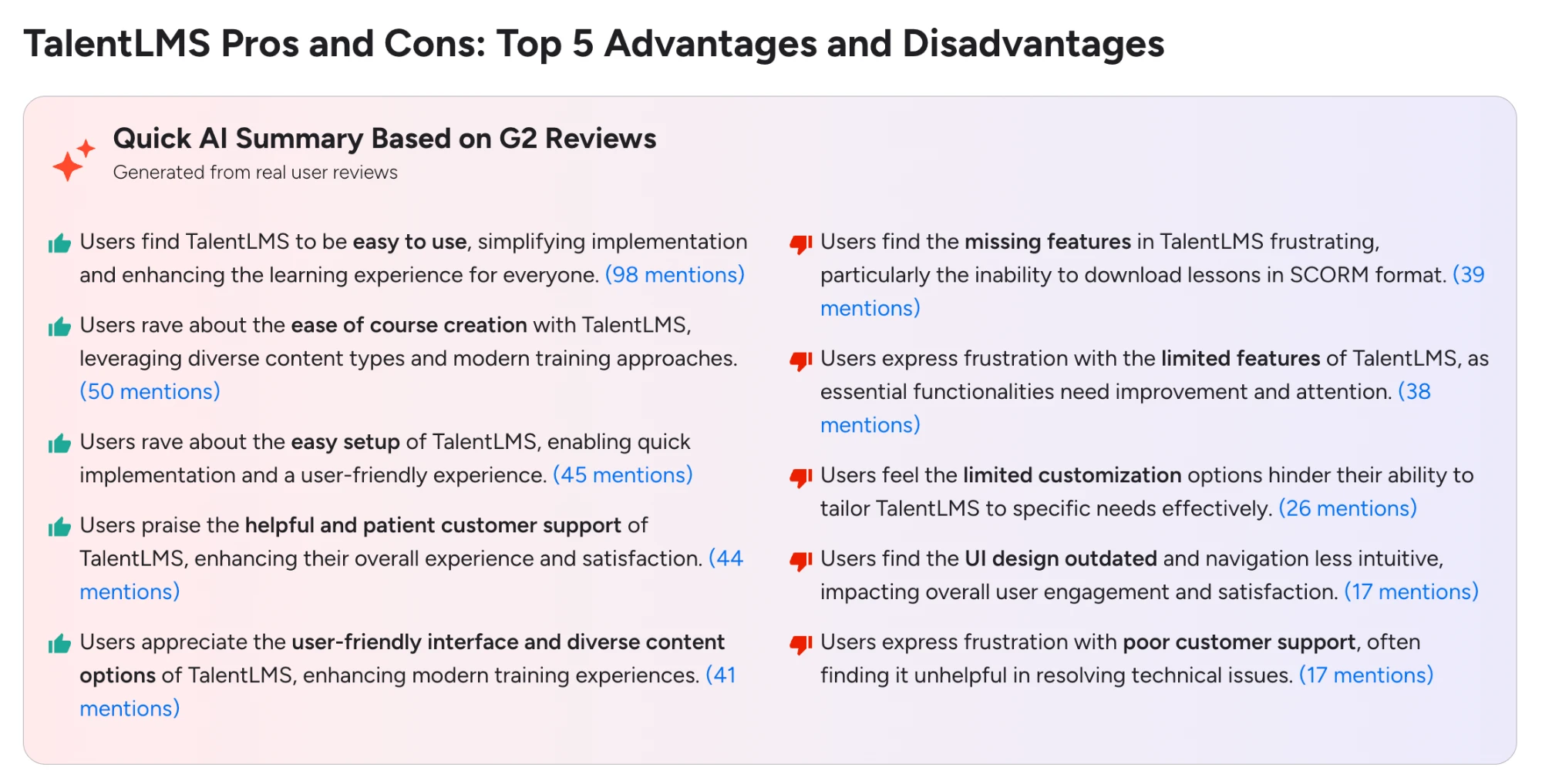
TalentLMS — pros & cons on G2.
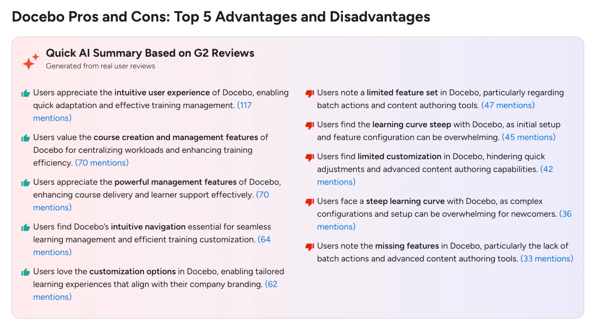
Docebo — pros & cons on G2.
Flows & patterns I mapped
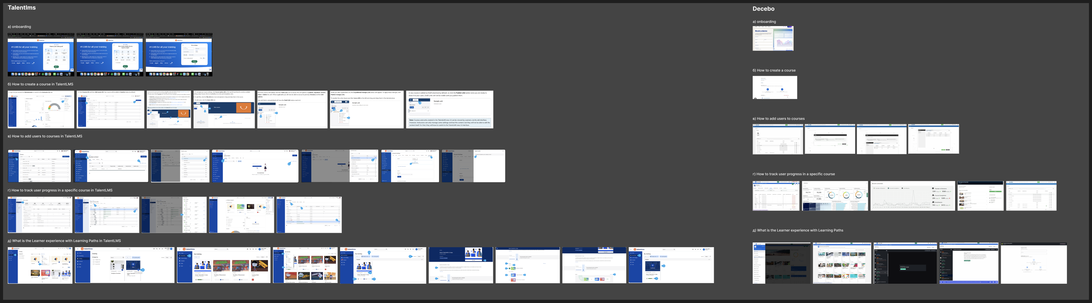
TalentLMS vs Docebo — flows mapped by task.
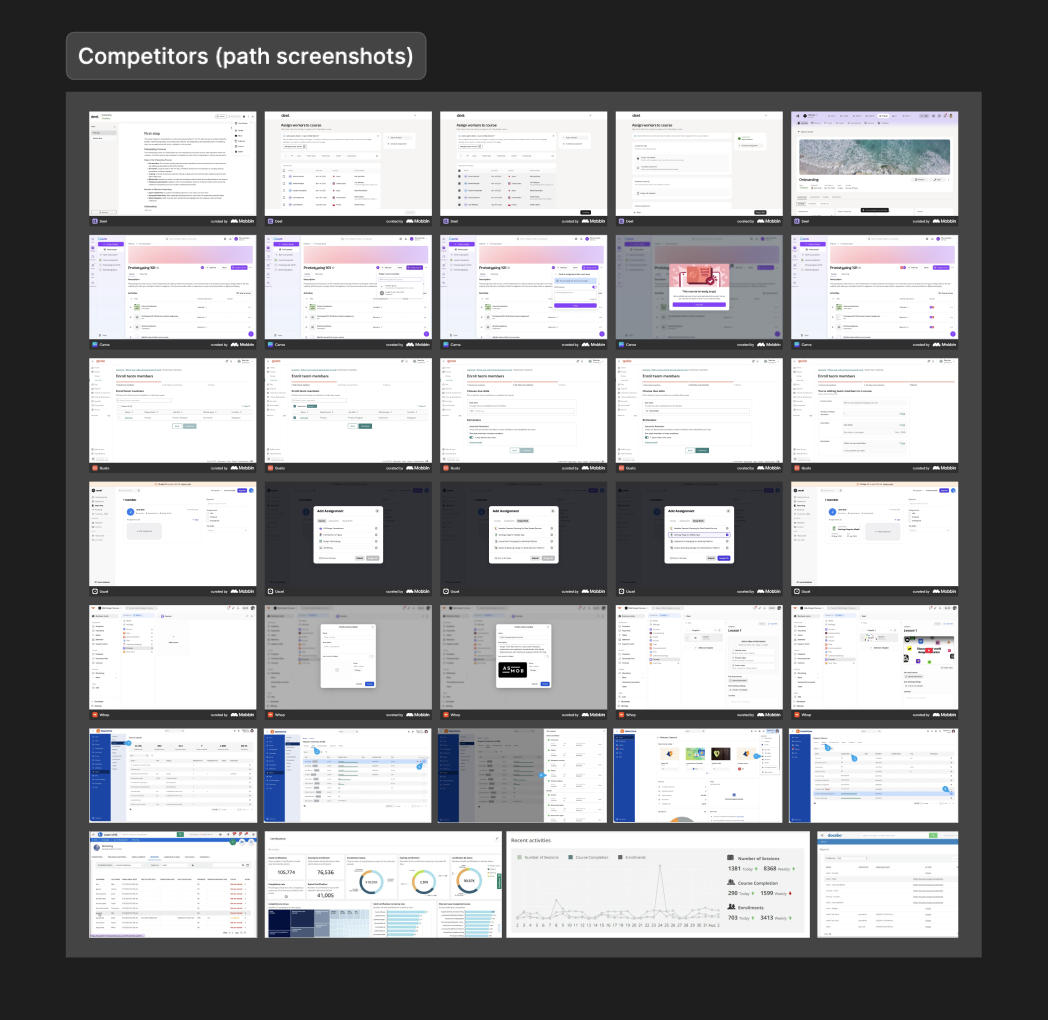
Patterns from other products (Mobbin).
From the research I defined a feature matrix and the MVP modules.
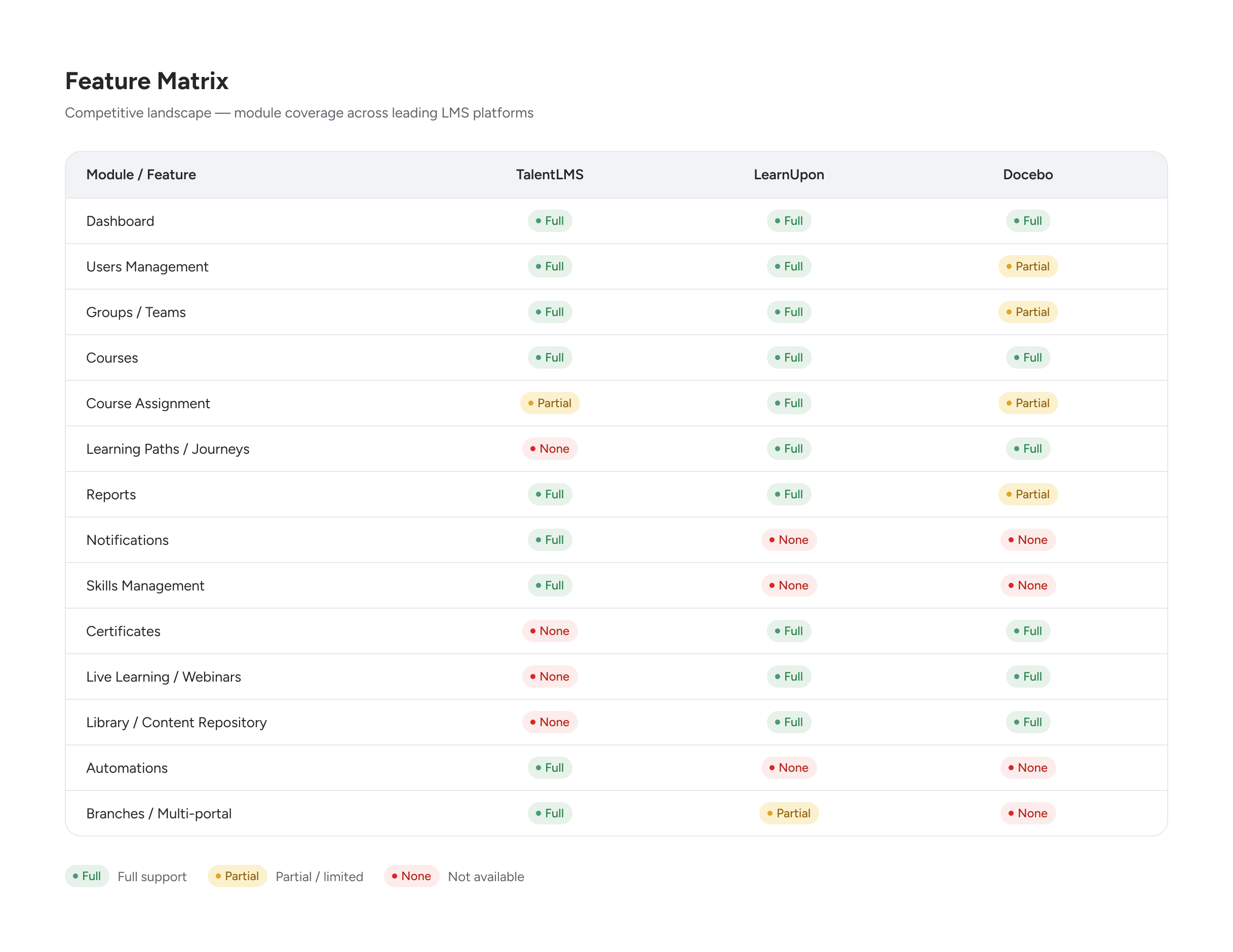
Fig 2. Feature matrix — module coverage across leading LMS platforms.
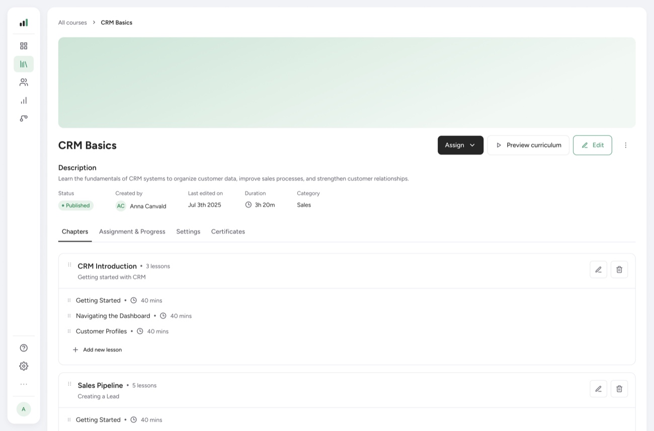
Before the process, here's the product working — a full run through the course creation flow, from the course list to a published, ready-to-assign course.
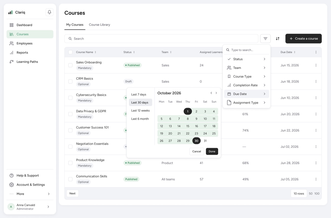
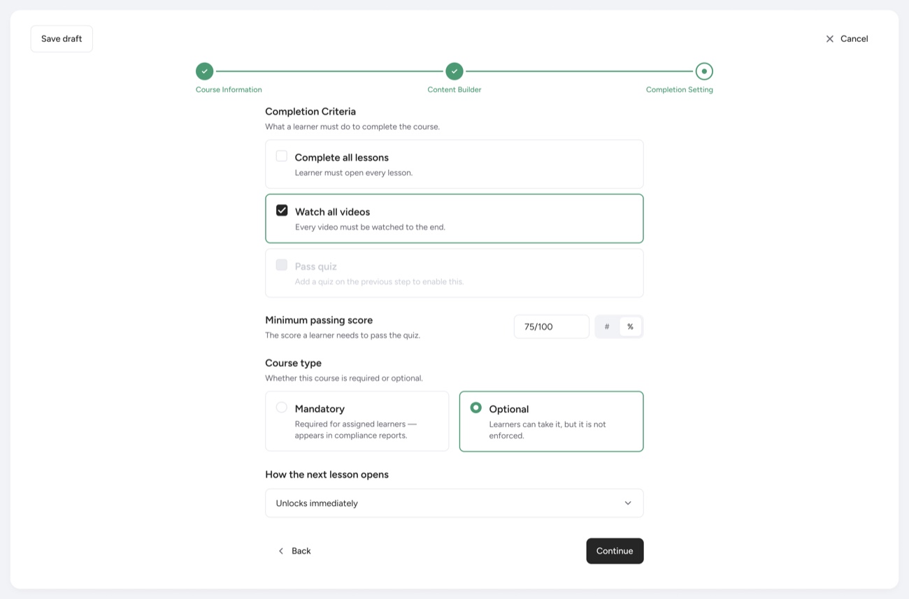
Creating a course, end to end — course list, details, content builder and completion settings.
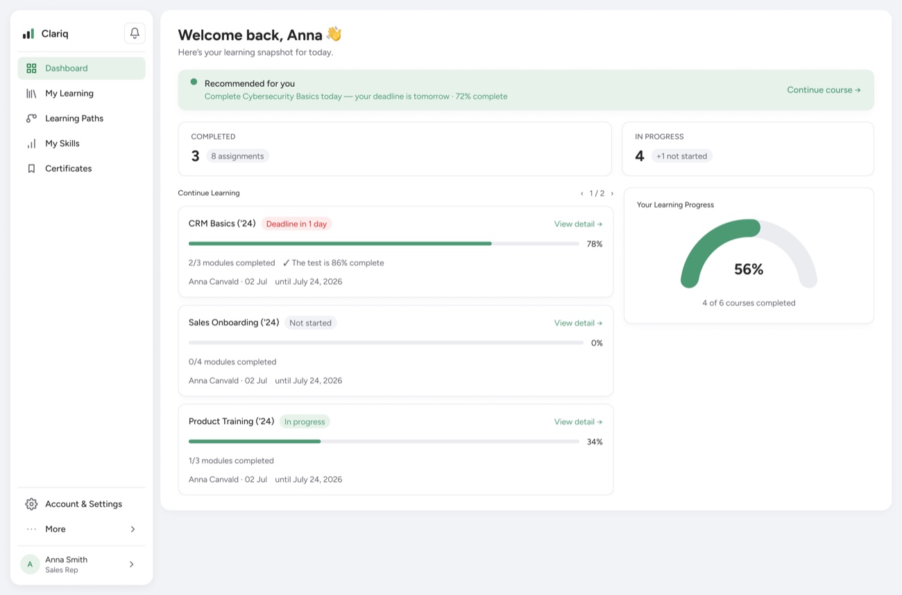
The main flows, end to end — admin side and employee side.
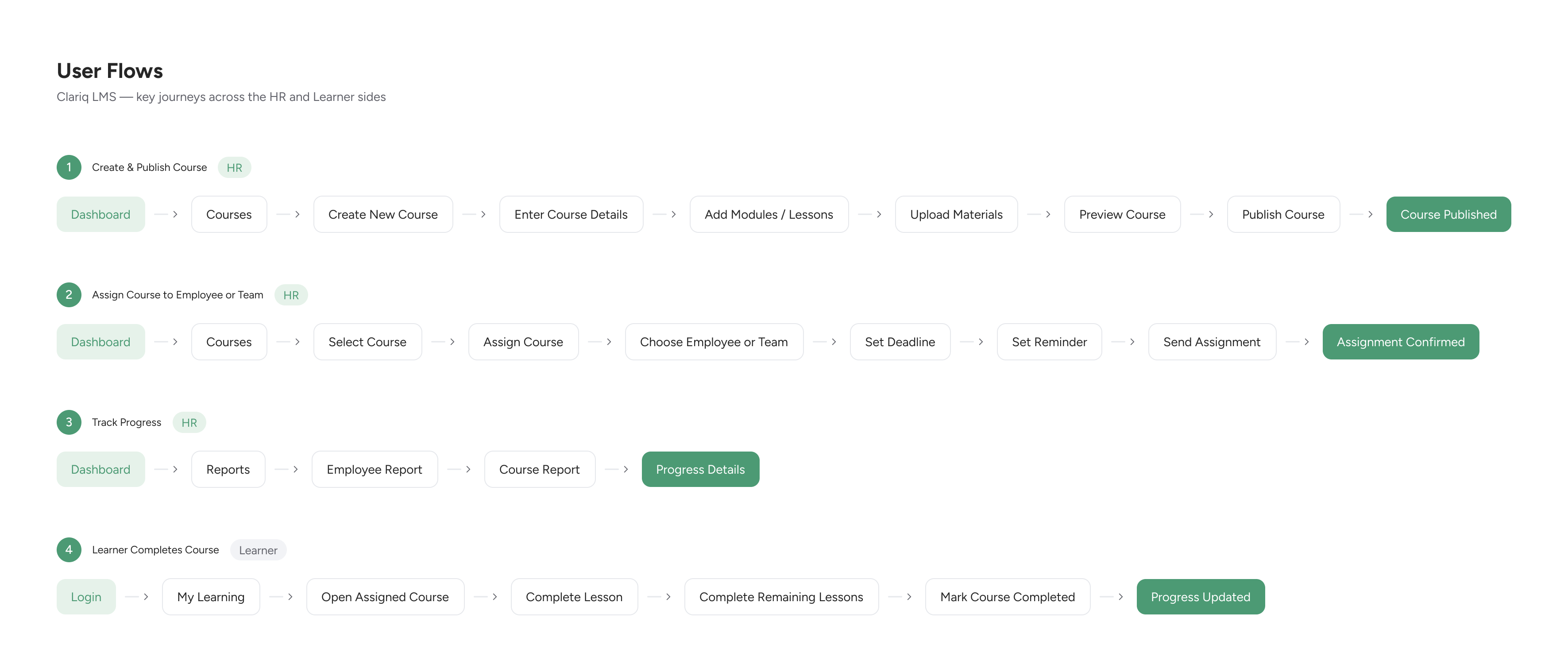
Fig 3. Key user flows — HR and learner journeys.
I mapped the product's sections and navigation to decide what to build and lay out the paths — so the wireframes had a clear structure to follow.
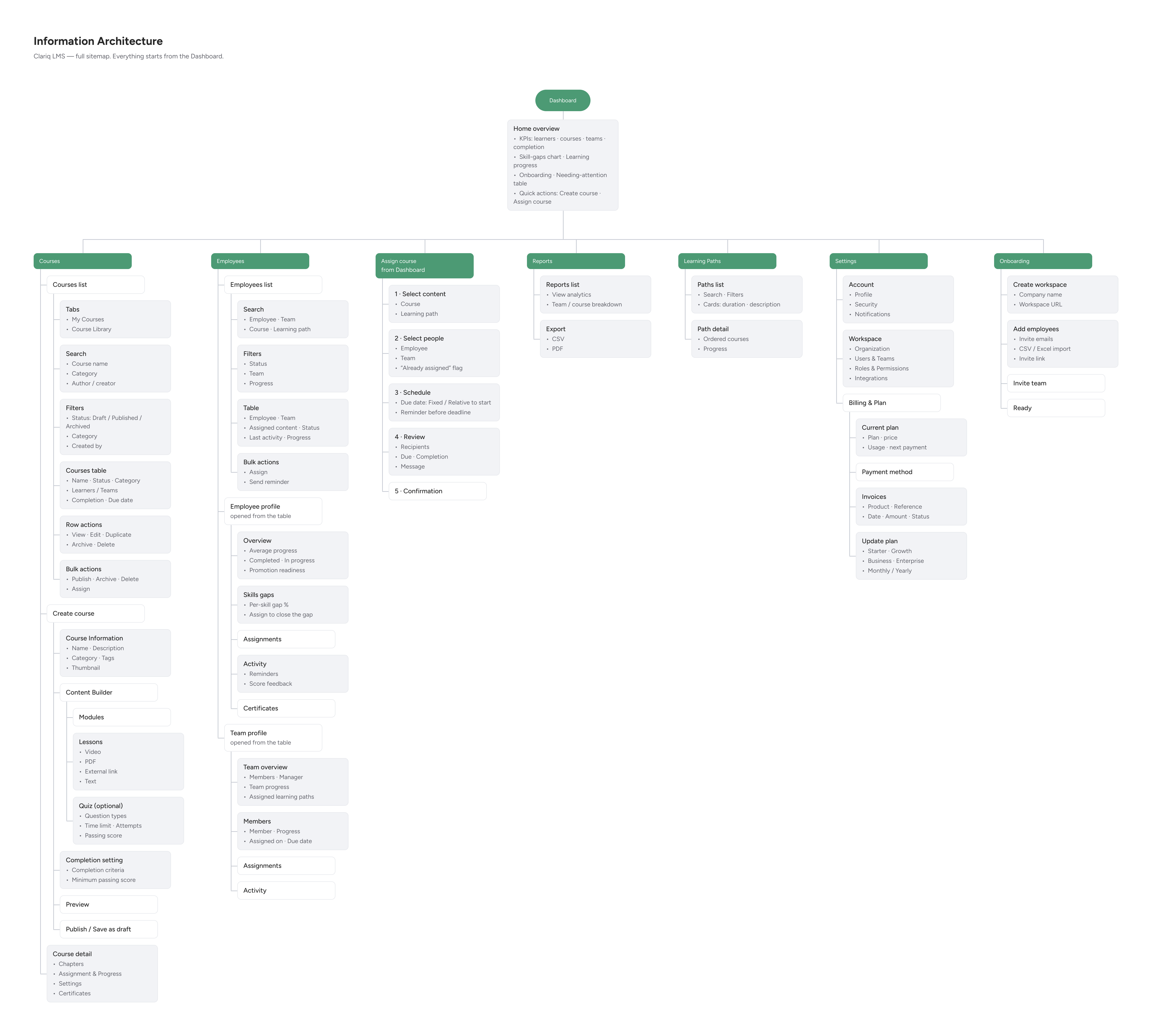
Fig 4. Full sitemap — everything starts from the Dashboard.
From there I moved to high-fidelity wireframes — laying out every path, the full functionality and placement in detail.
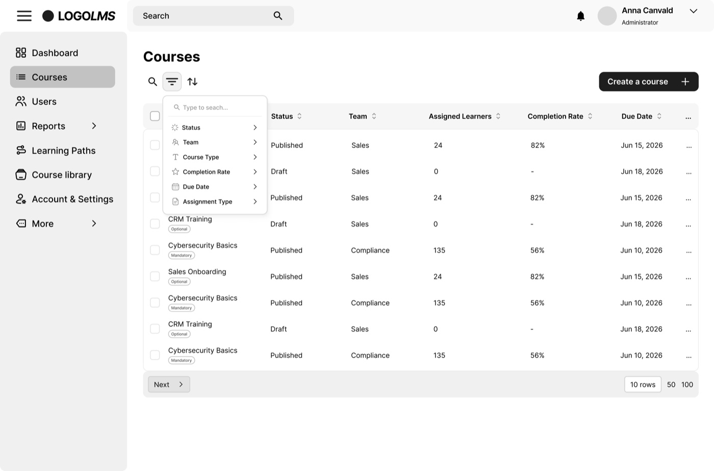
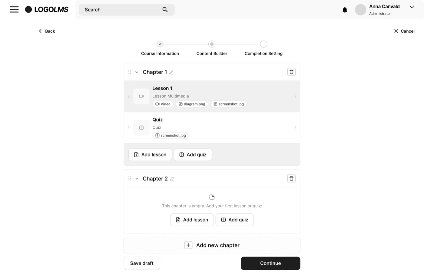
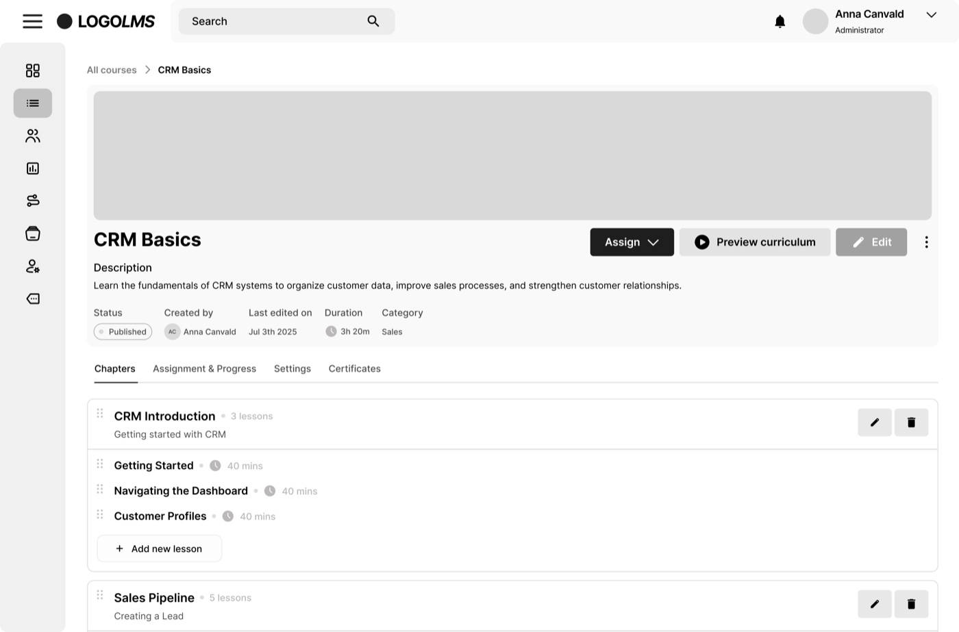
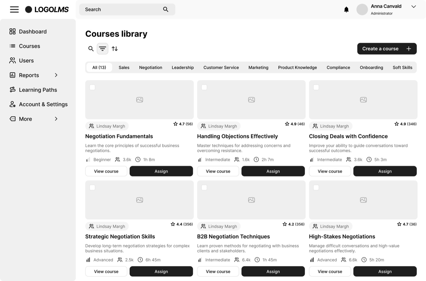
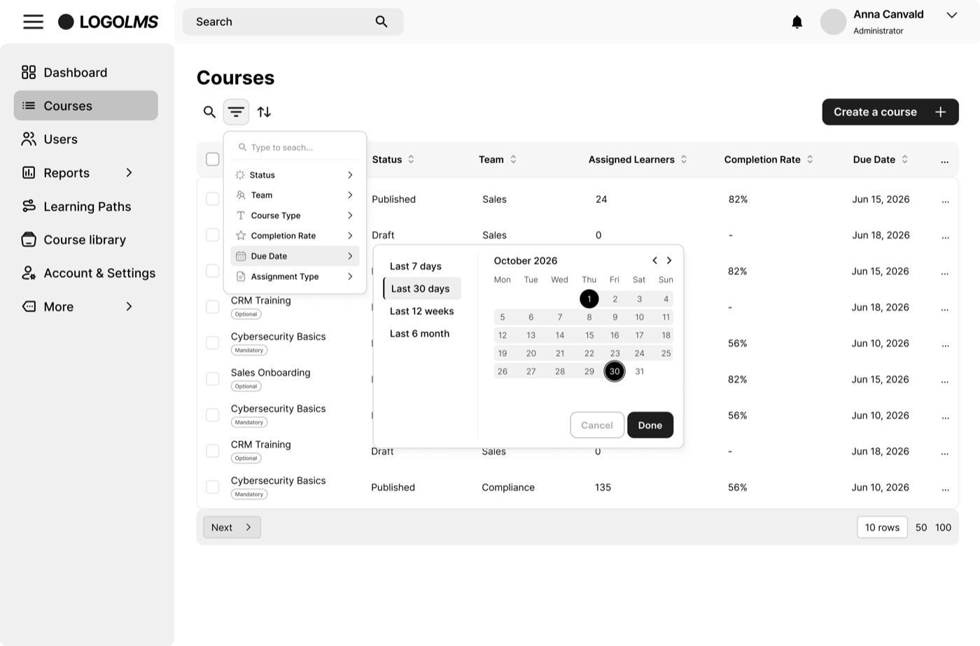
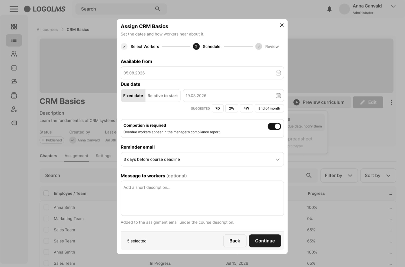
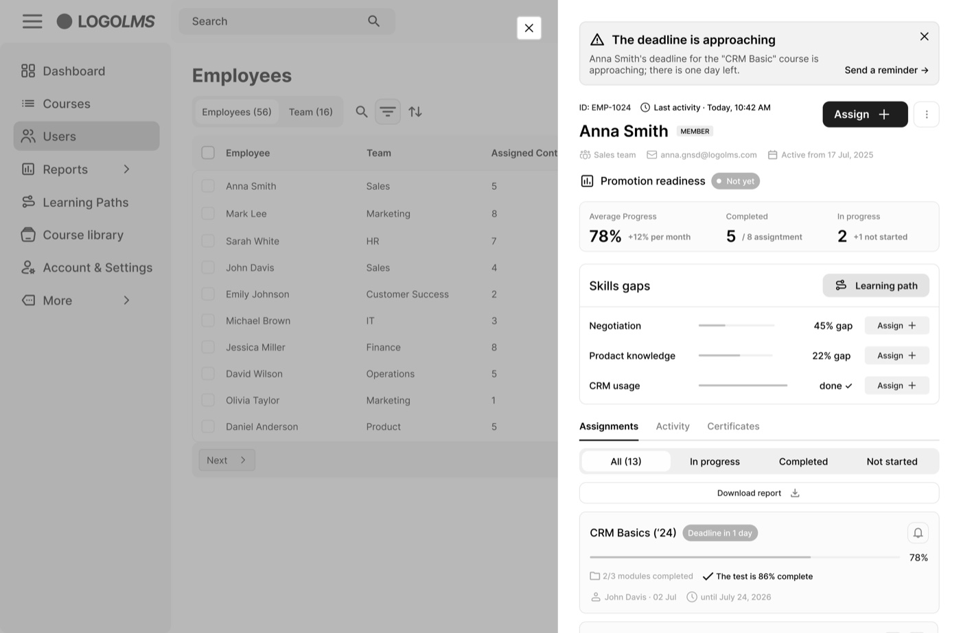
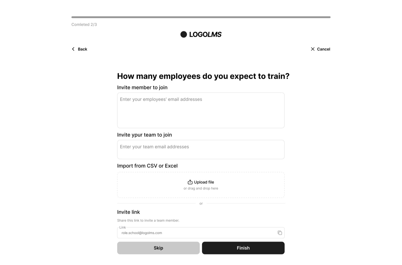
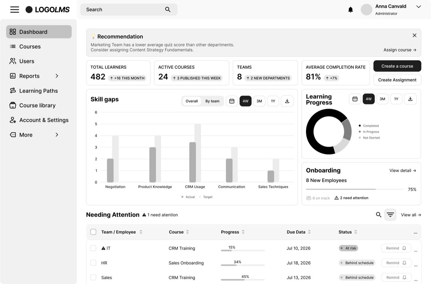
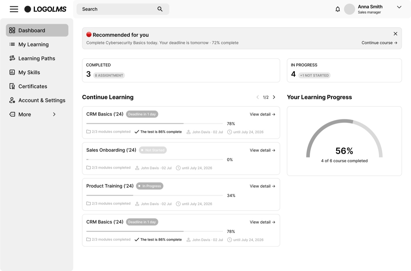
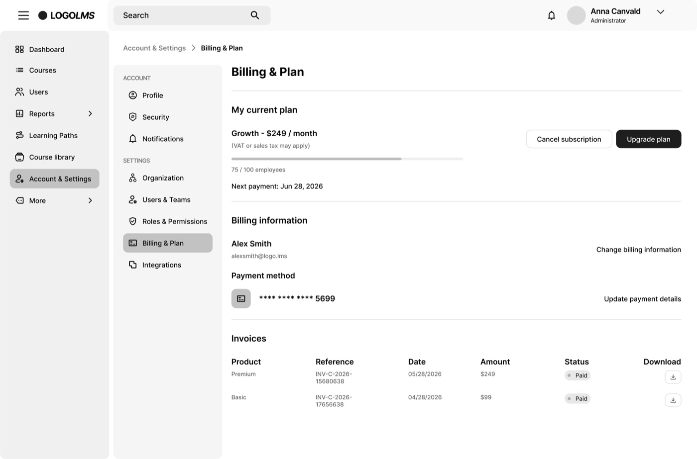
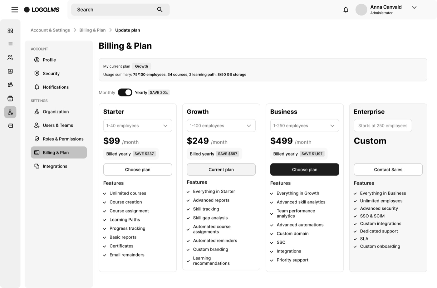
Fig 5. High-fidelity wireframes — every core screen and state, laid out end to end.
MethodI built a clickable prototype and ran the tasks with 5 relevant users (U1–U5) over Zoom in September 2026: create a course, set deadlines and reminders, assign it to a team, check progress. I clustered everything into an affinity map in FigJam.
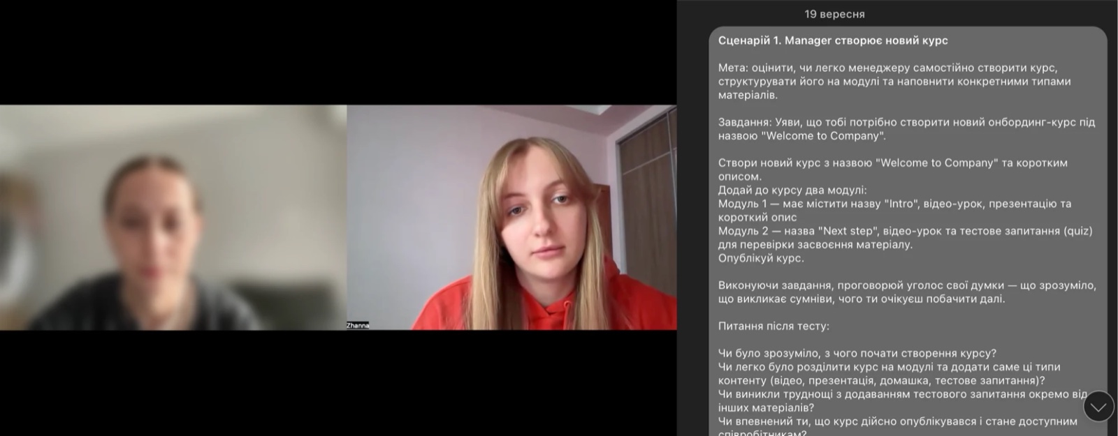
Fig 6. Running the tasks with users over Zoom — the task scenario alongside the call.
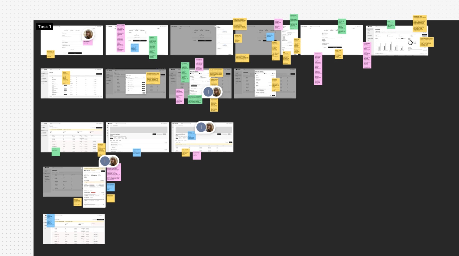
Fig 7. Findings clustered in FigJam.
Each one is a change I made after testing — the problem, the fix, and before / after.
What changed · 01
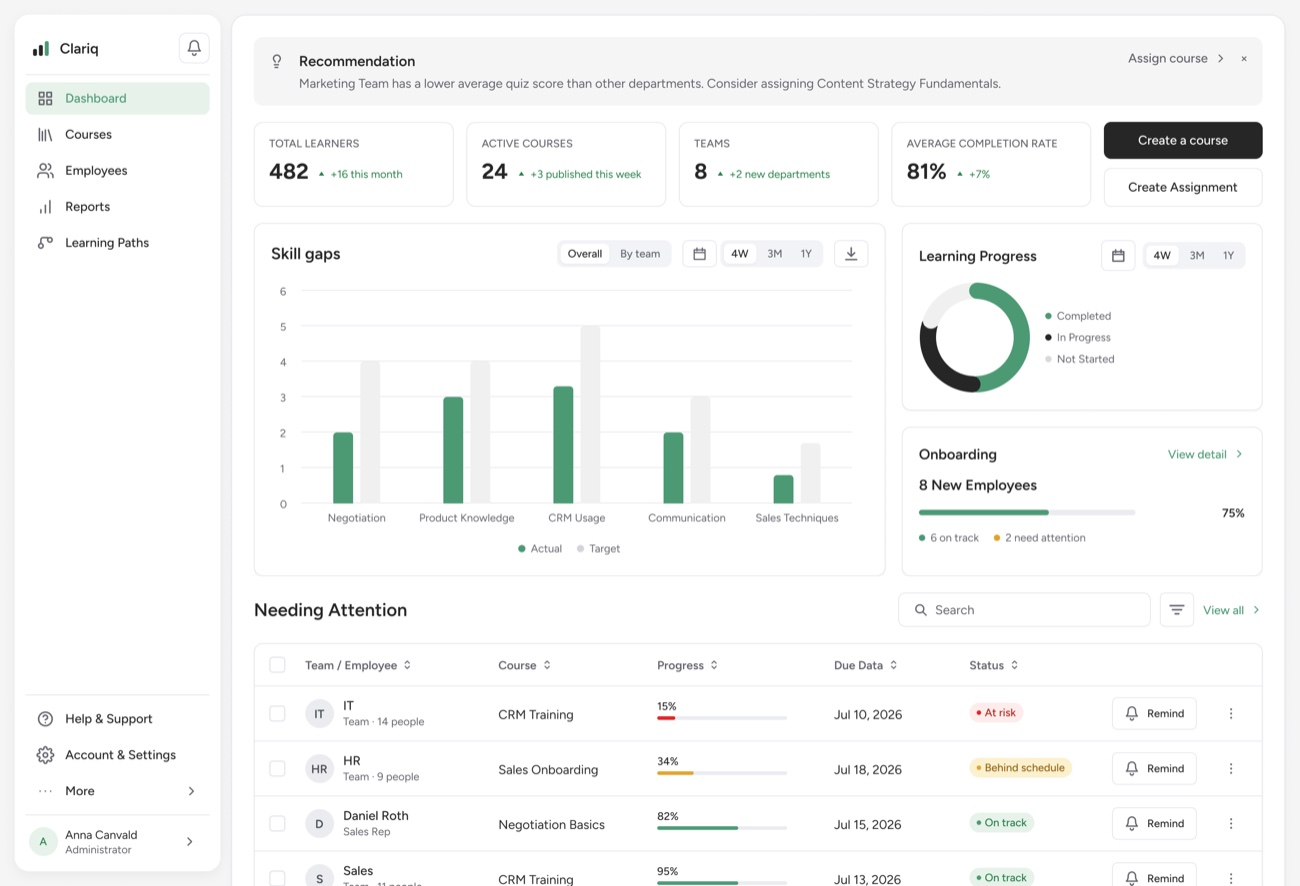
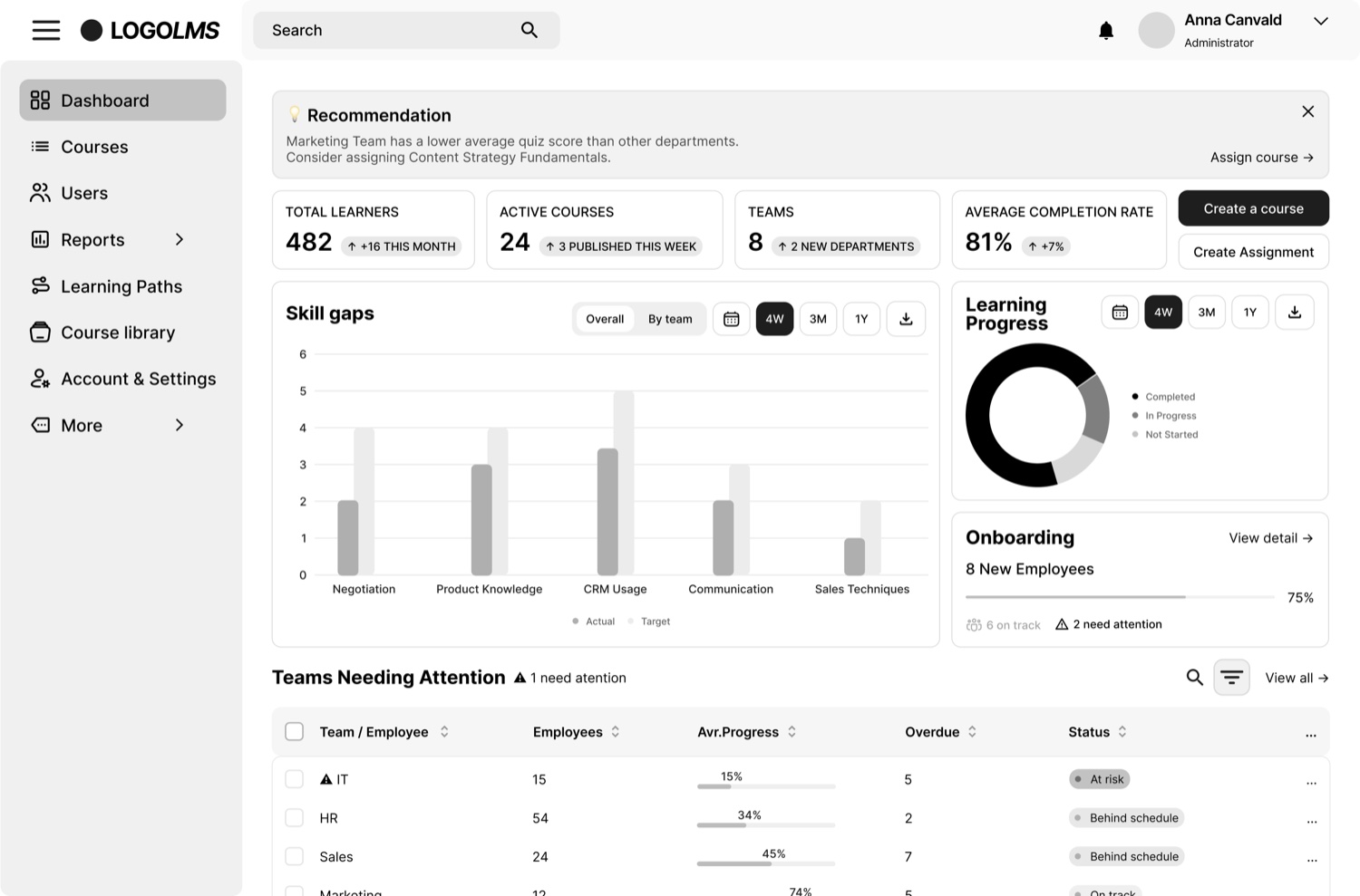
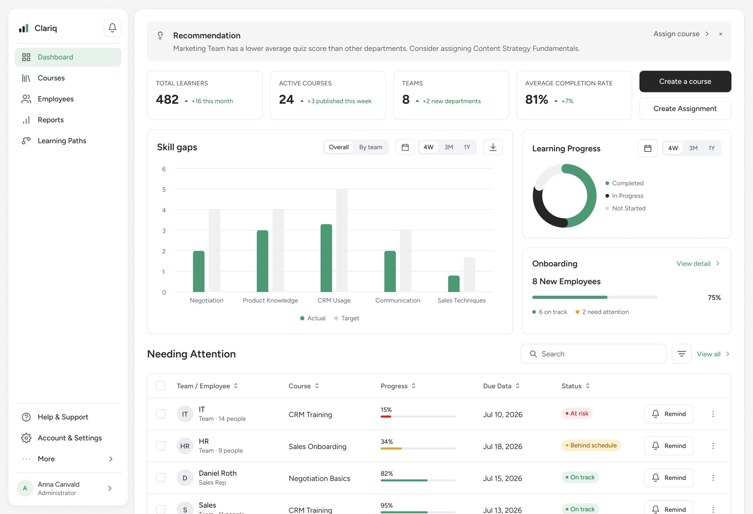
FindingThe table (then "Team needing attention") showed team, number of employees, average progress, overdue and status — which didn't tell the manager what was actually wrong, or who specifically needed help.
ChangeRenamed to "Needing Attention" — it's not only teams, a single person can need it too. Reworked the columns to Team / Employee · Course · Progress · Due date · Status, with a Remind quick action. Now it points to the exact course and person, and you can act in one click.
What changed · 02
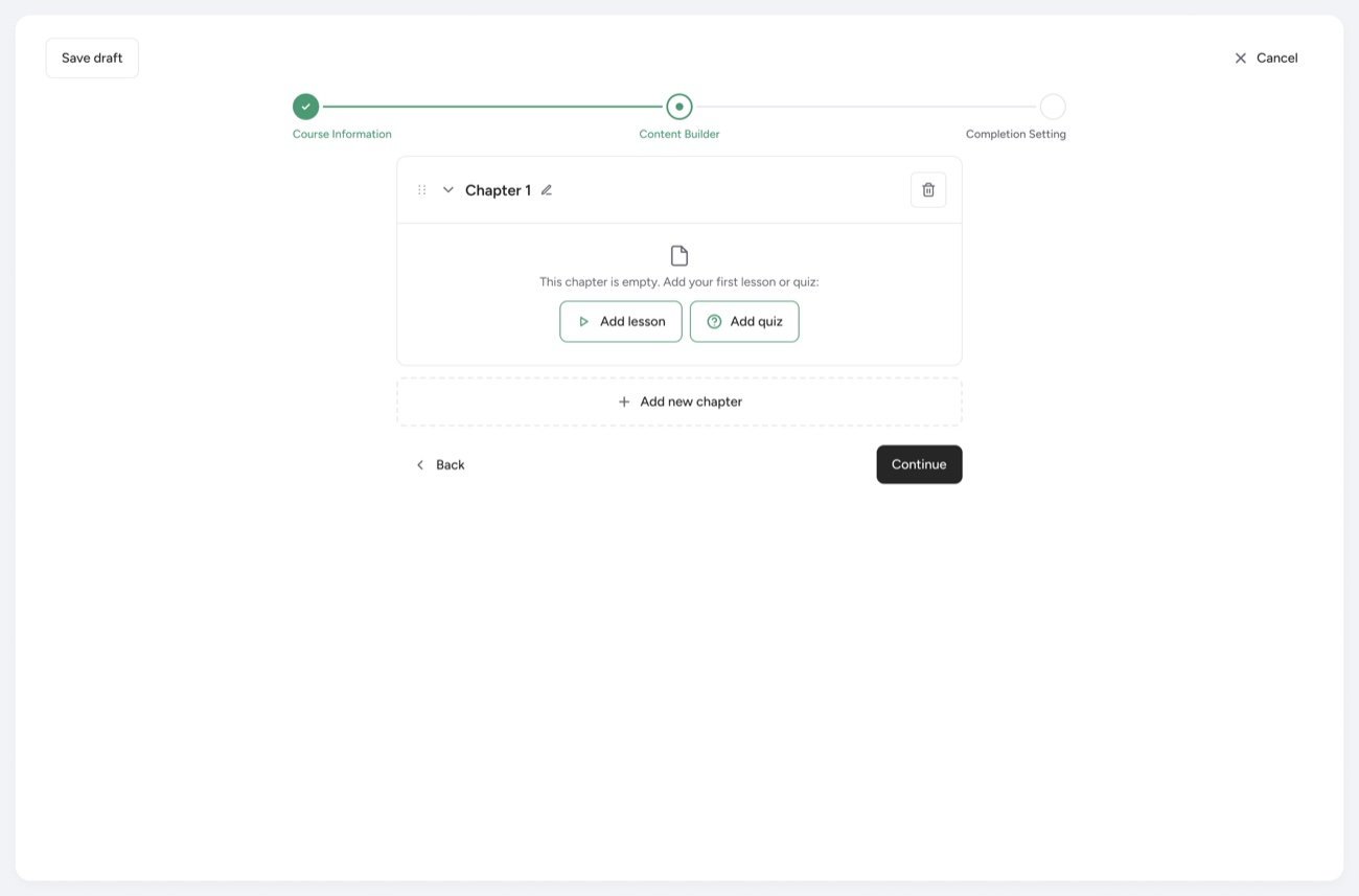
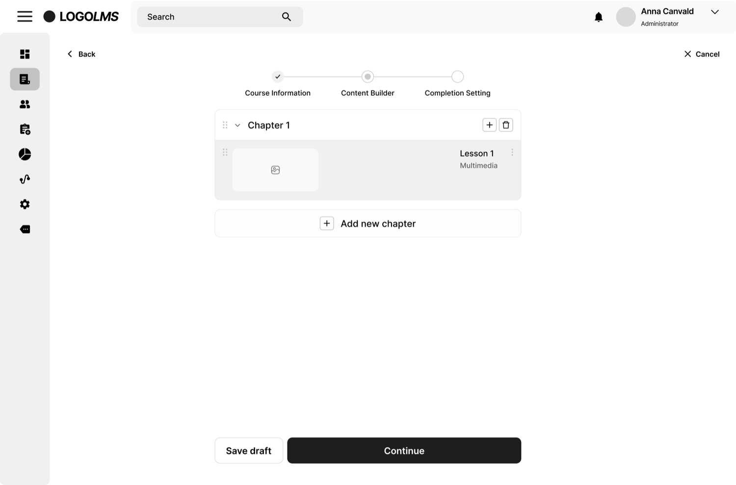
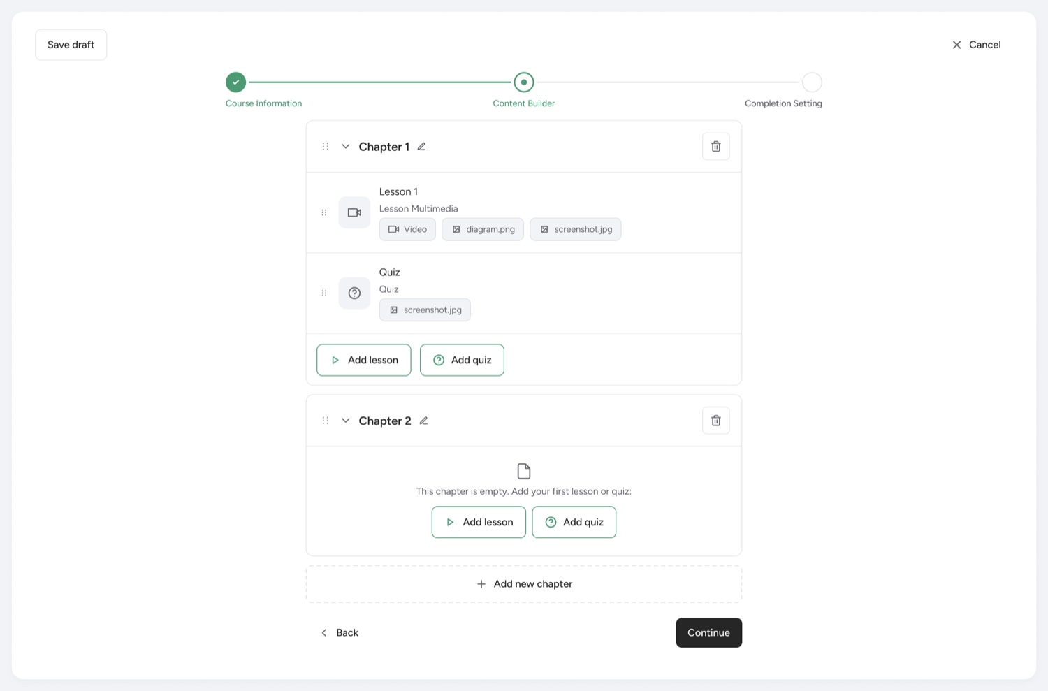
FindingThe Content Builder step had just a + icon; in testing, people didn't realize that "Add lesson" and "Add quiz" lived inside it.
ChangePulled those actions out and placed them directly in the module, highlighted, so adding a lesson or a quiz reads as the main action. No more guessing.
What changed · 03
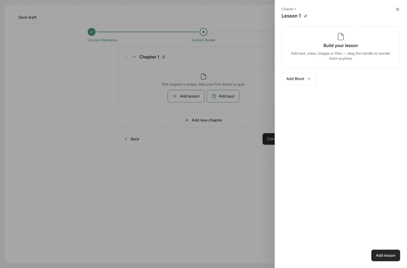
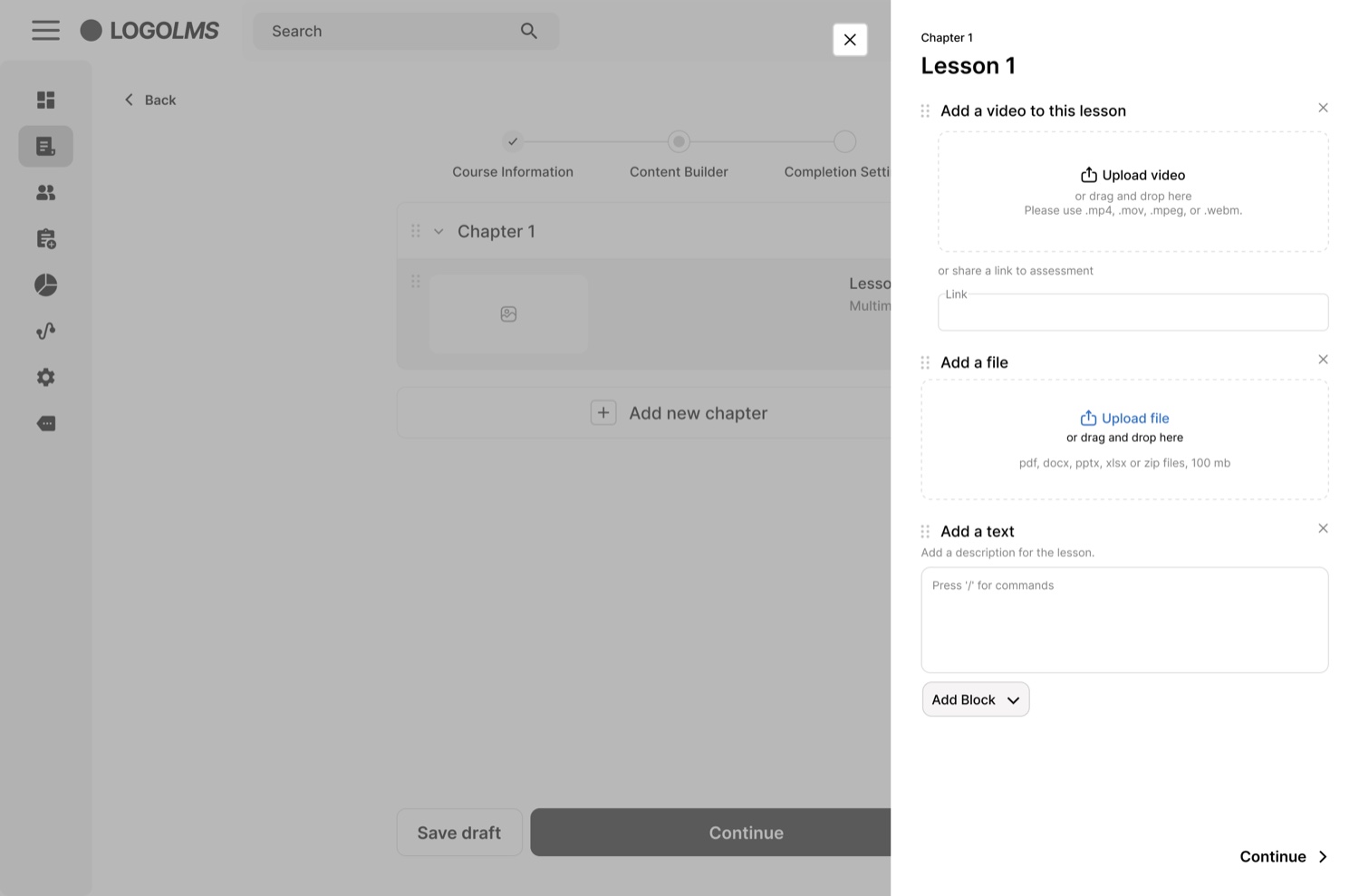
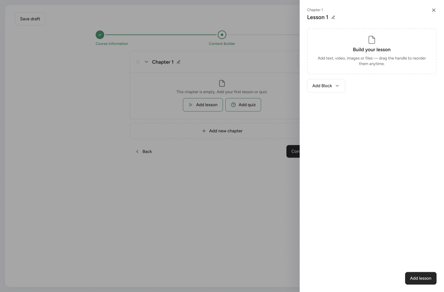
Finding"Add lesson" opened a rigid template with video, file and text fields already added — whether you needed them or not.
ChangeNow it's a "Build your lesson" block builder — add only the blocks you want (just a video, just text, and so on). A plain builder means the person sees only what to focus on, which cut the cognitive load.
What changed · 04
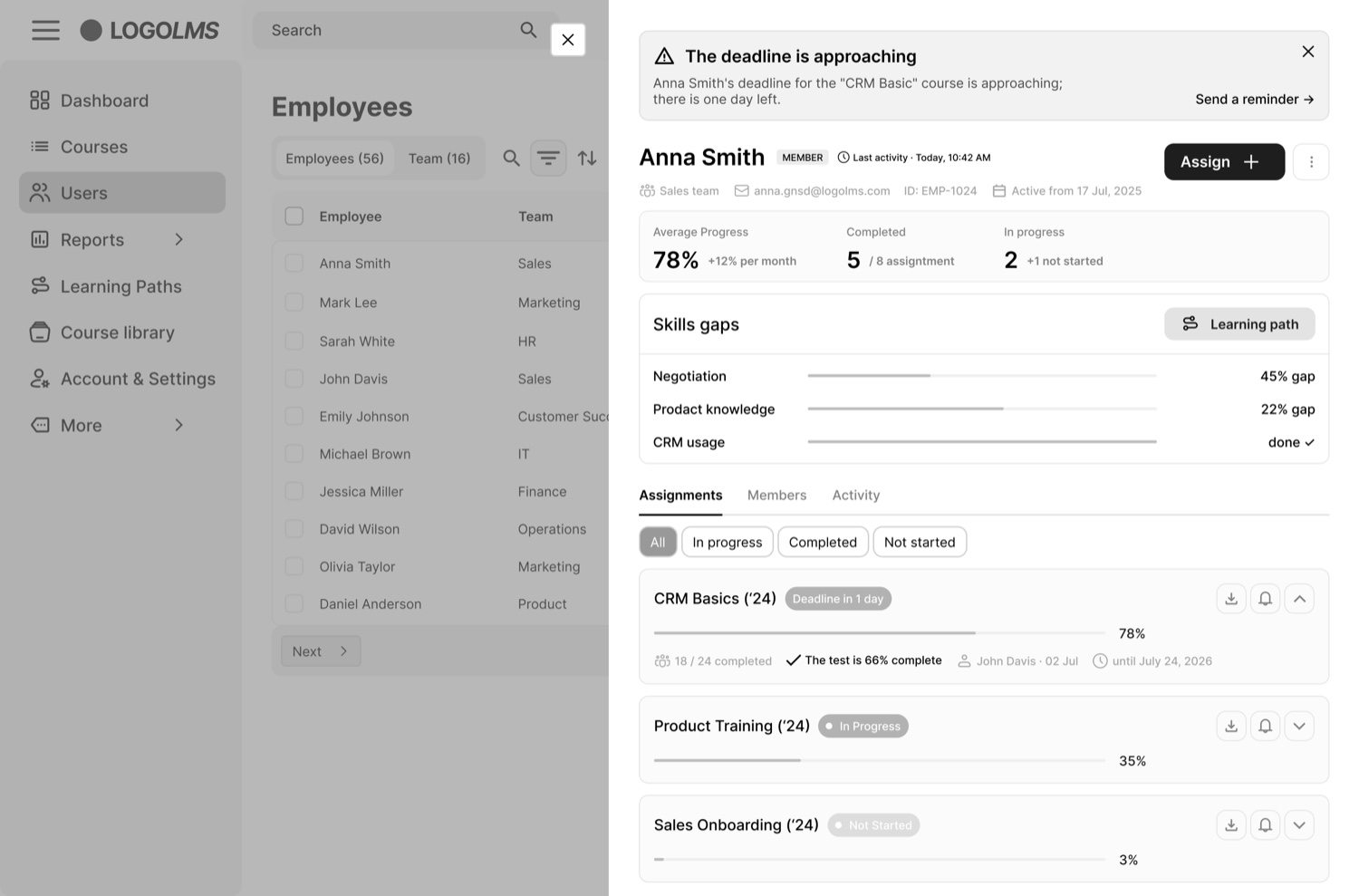
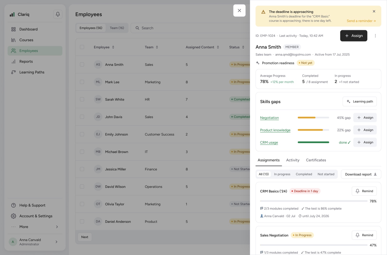
FindingThe profile showed numbers without a clear "so what" or a way to act on them.
ChangeAdded a quick Assign button next to each course in Skill Gaps (close a gap on the spot), and a "Promotion Readiness" label so the platform signals whether someone's ready for a promotion. The profile now answers questions instead of showing random numbers.
I wanted to move away from the dated LMS look and make Clariq modern, minimal and intuitive. People using it work with a lot of data, so I kept the colors calm and unobtrusive — easy on the eyes and easy to read across long sessions.
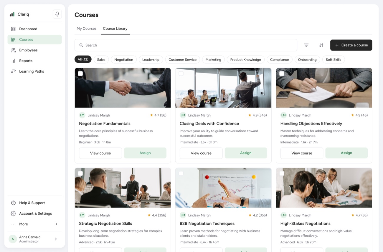
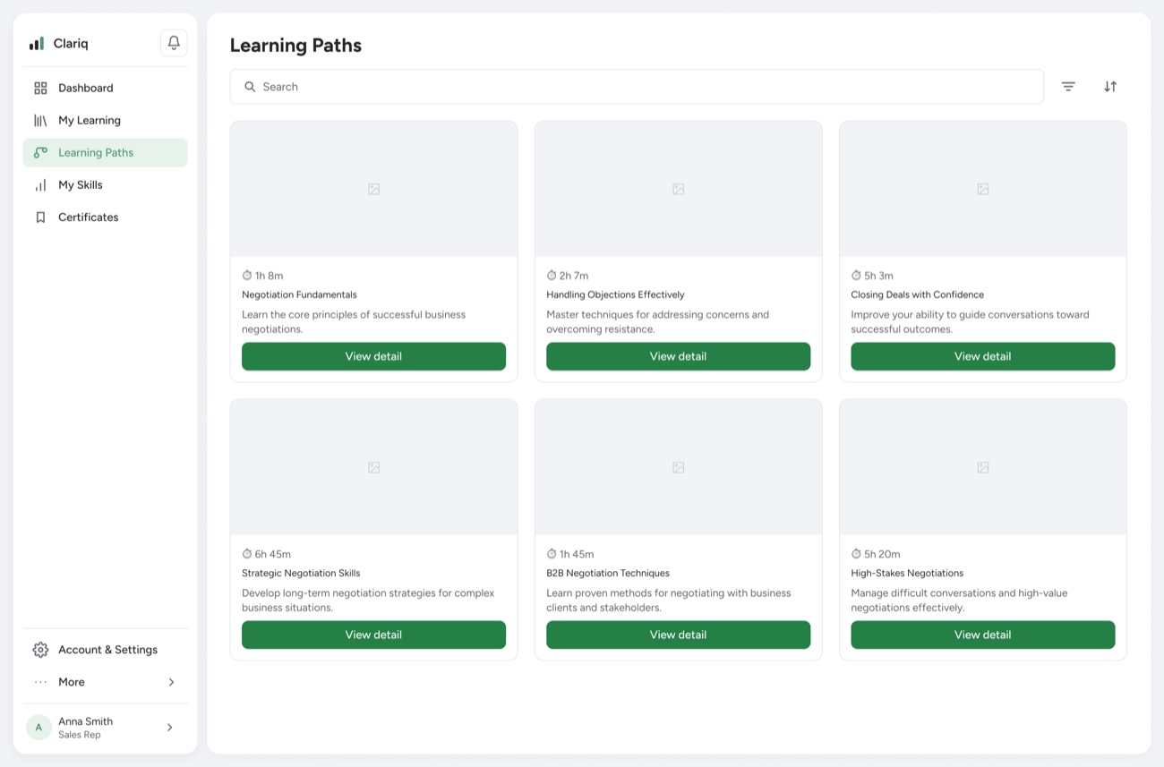
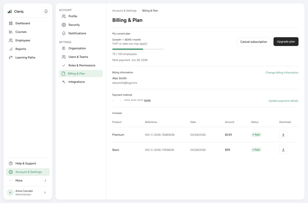
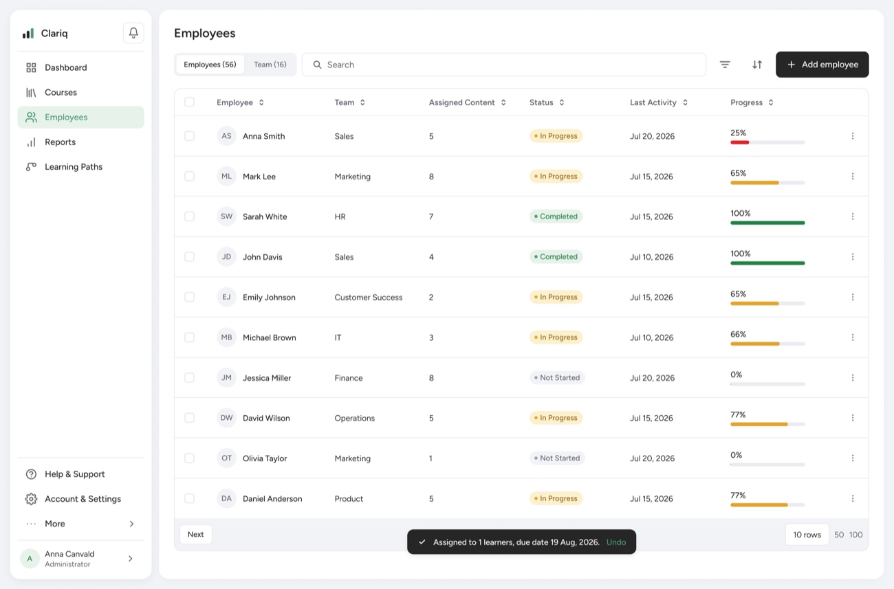
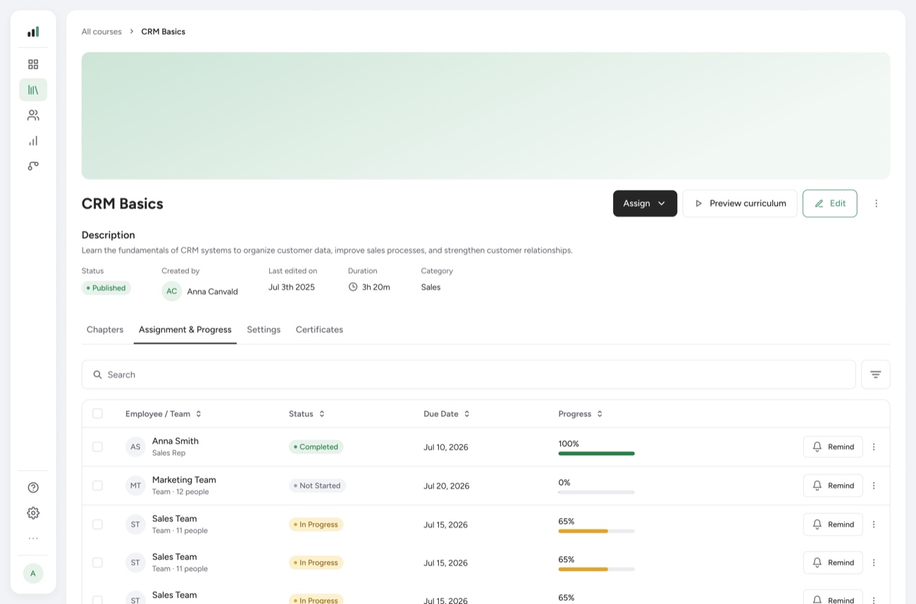
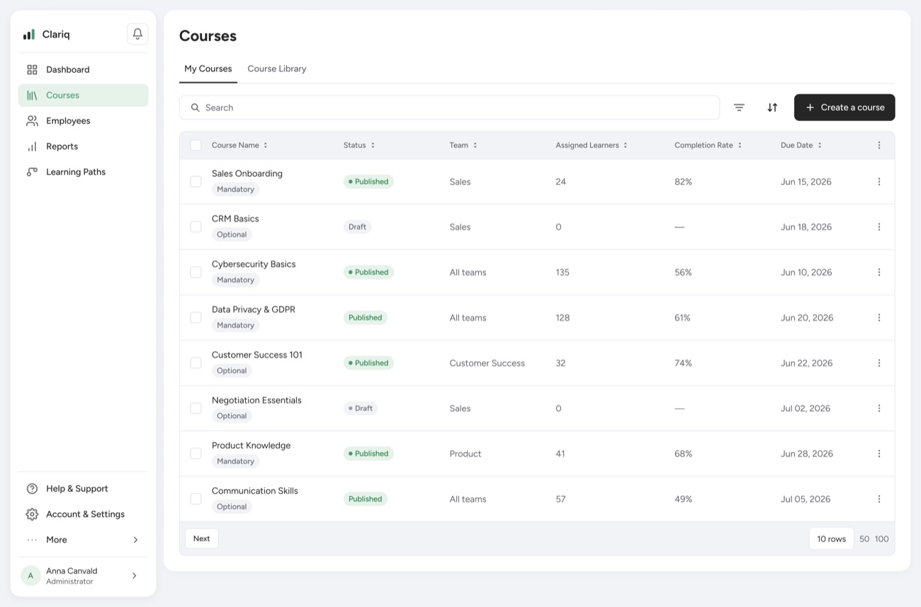
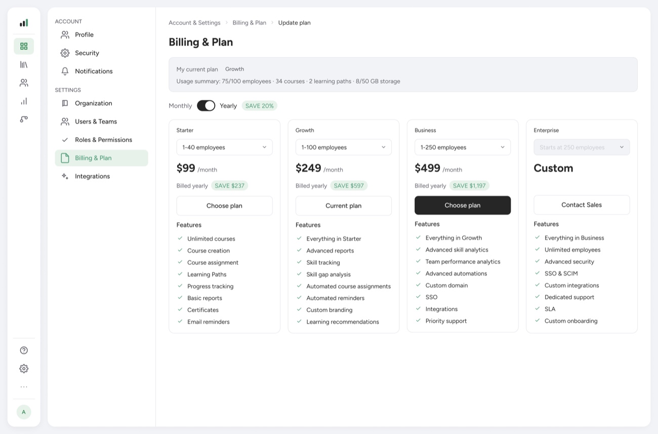
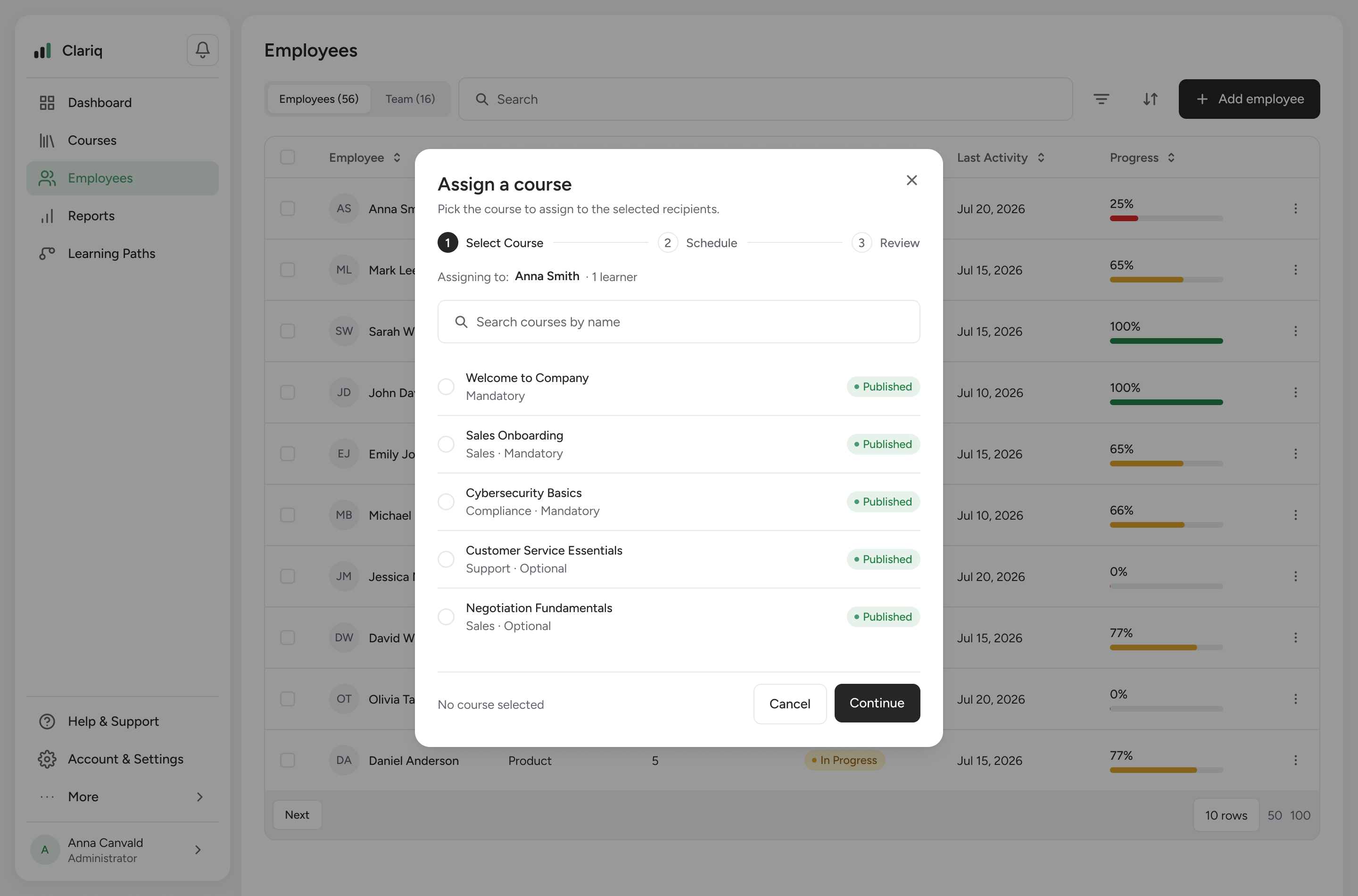
Fig 8. A sweep across the final interface.
I set up a full design system to keep the UI consistent — color and spacing tokens, typography, and a library of 21 component sets from atoms to organisms: buttons, fields, the People table, metric cards, sidebar and dialogs. I built it out with the help of AI (Claude).
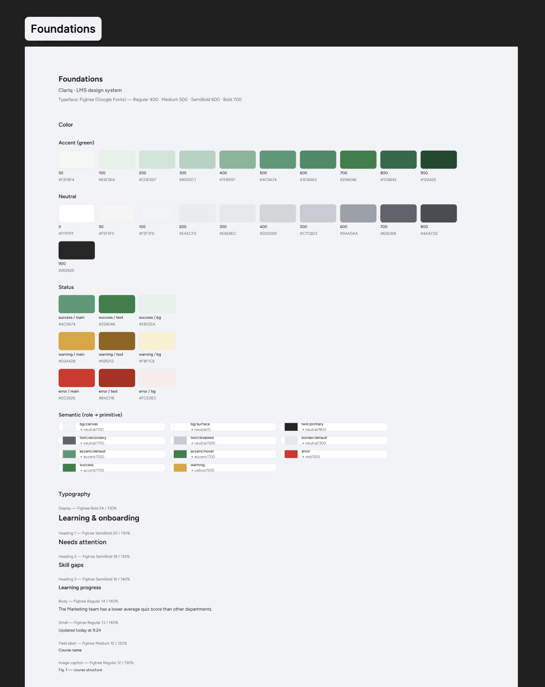
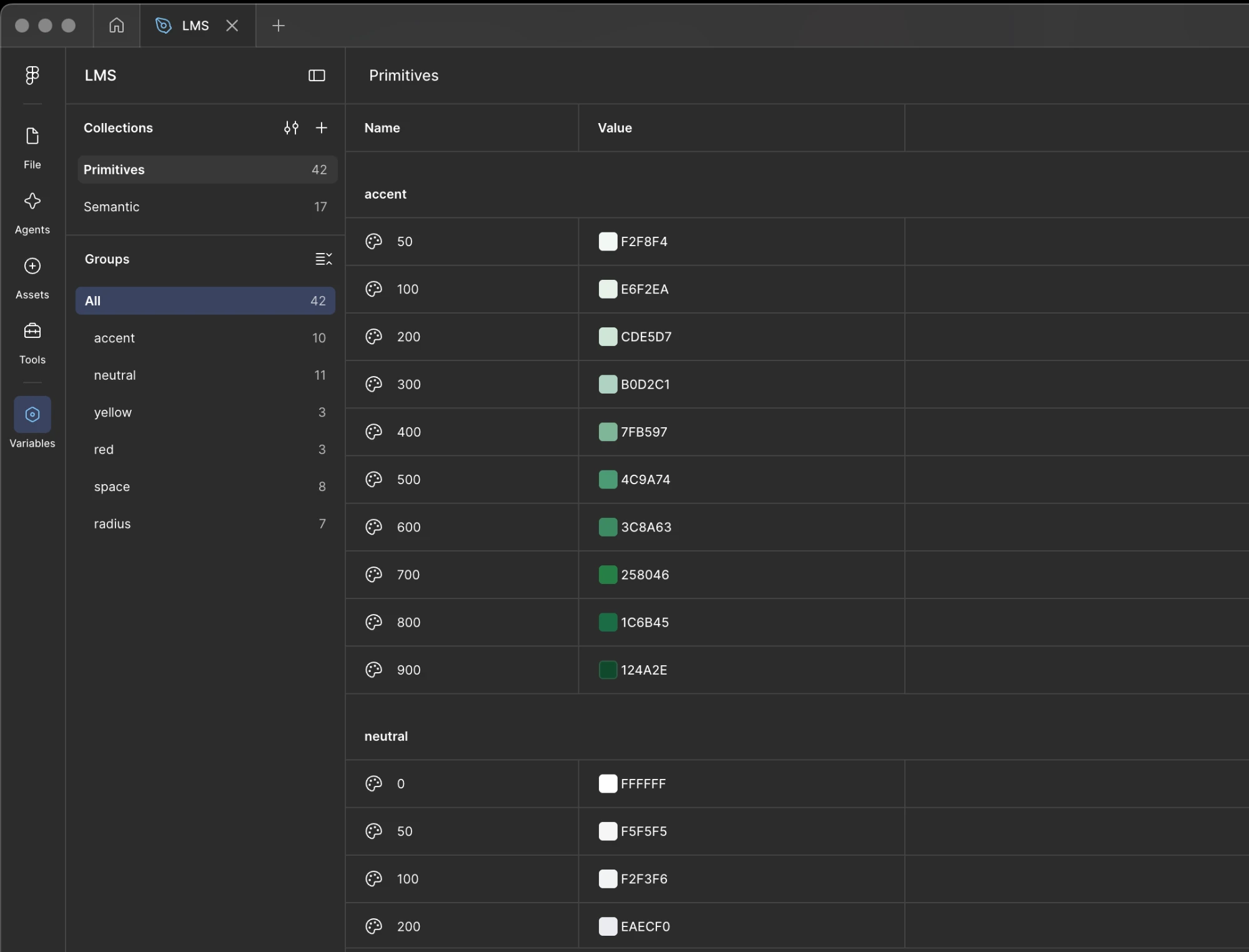
Fig 9. Foundations and design tokens — documented and built as Figma variables.
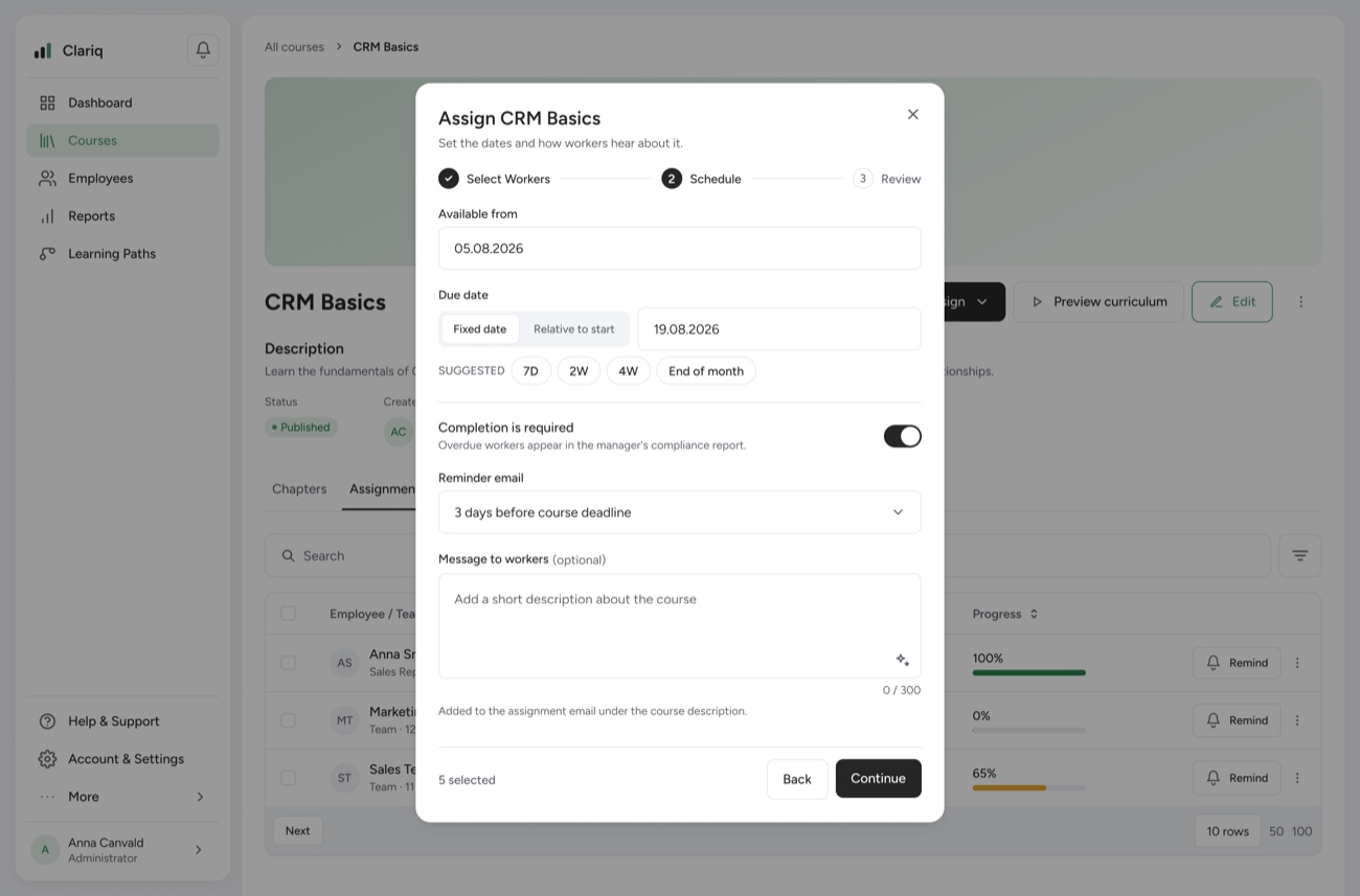
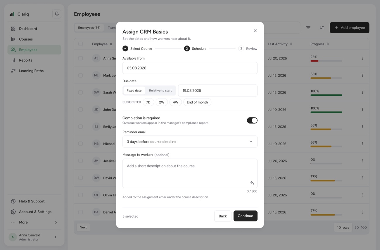
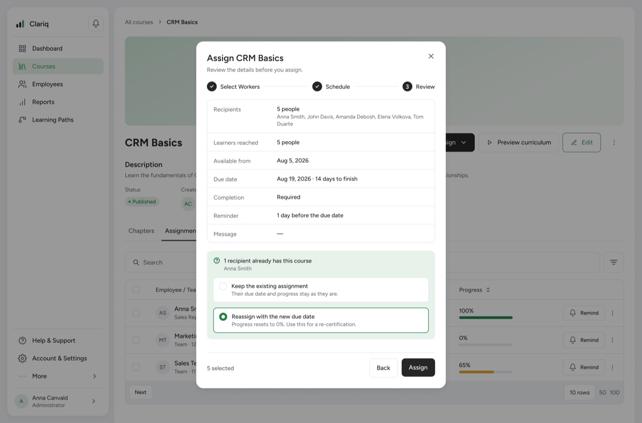
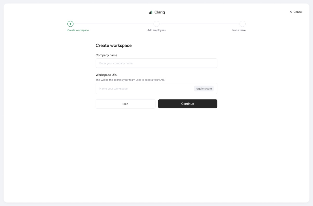
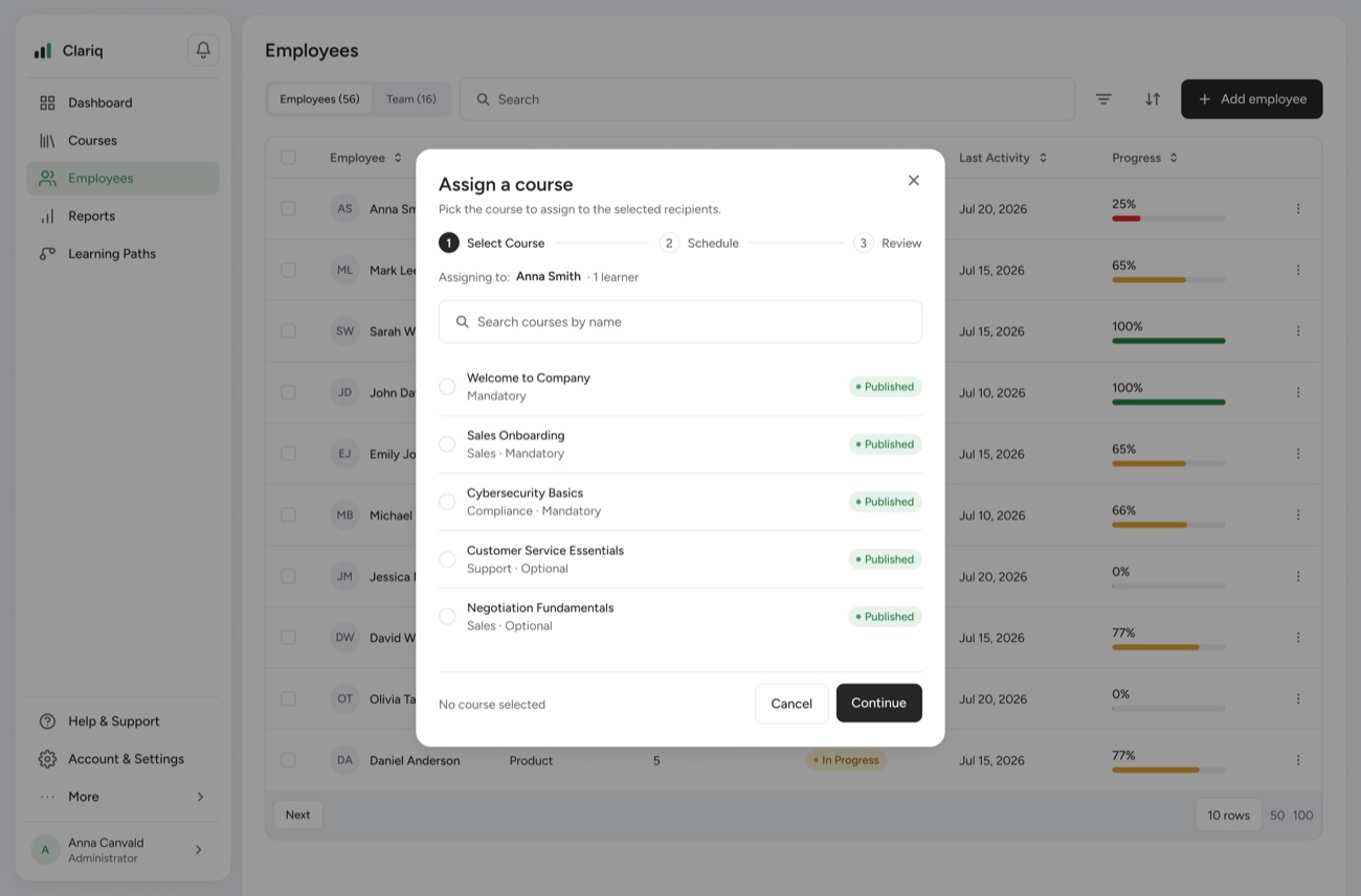
One of the ways to assign a course to a user — right after you create it, or later by opening the course settings. Choose people or teams, set the schedule, review, and send.
Assigning a course — select workers, set the schedule, review, done.
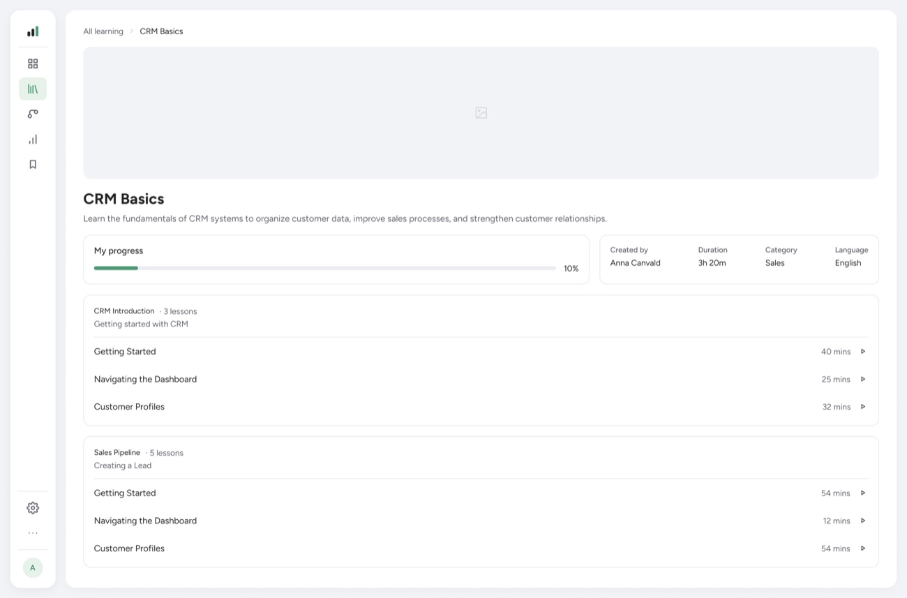
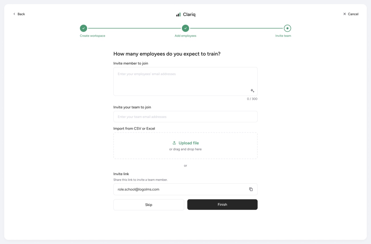
The breadth of the UI across the main sections.
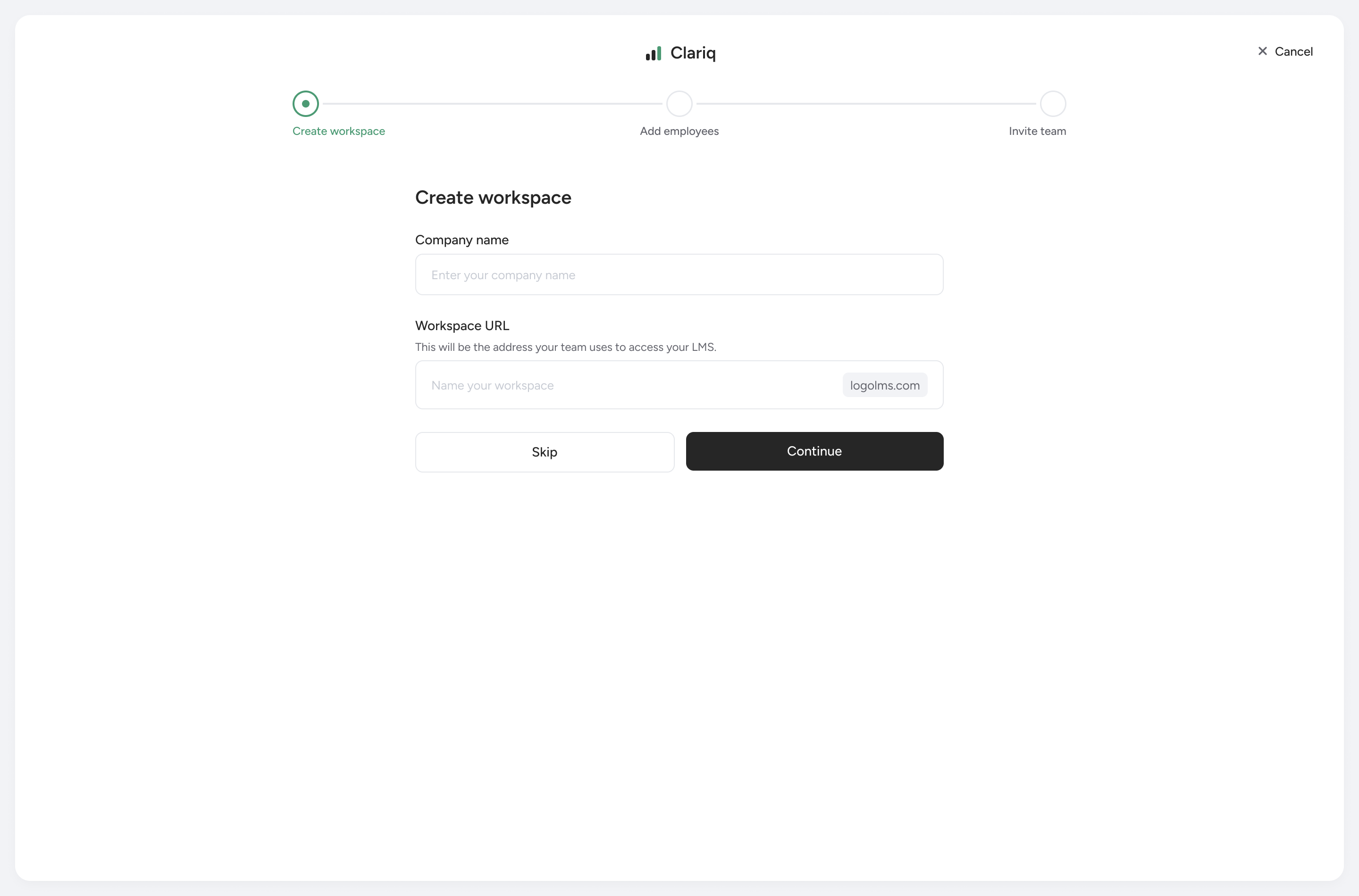
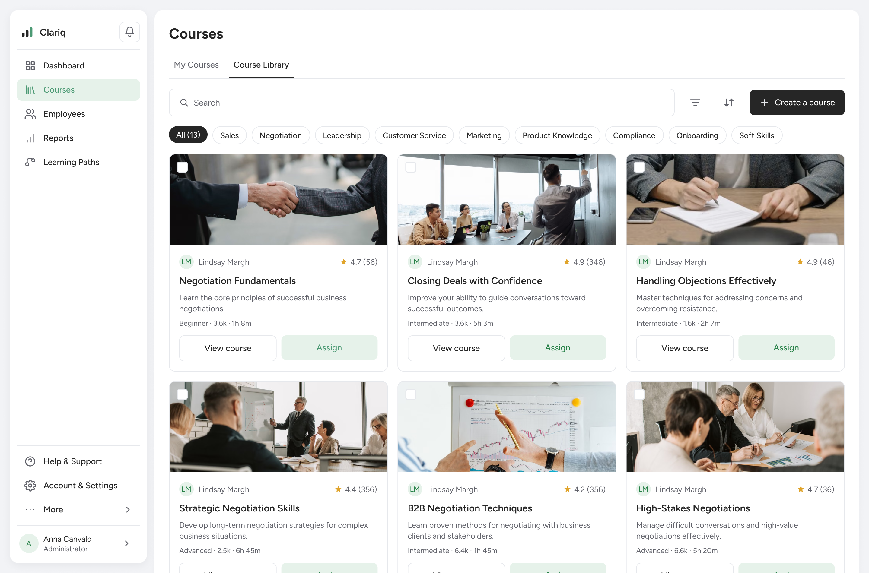
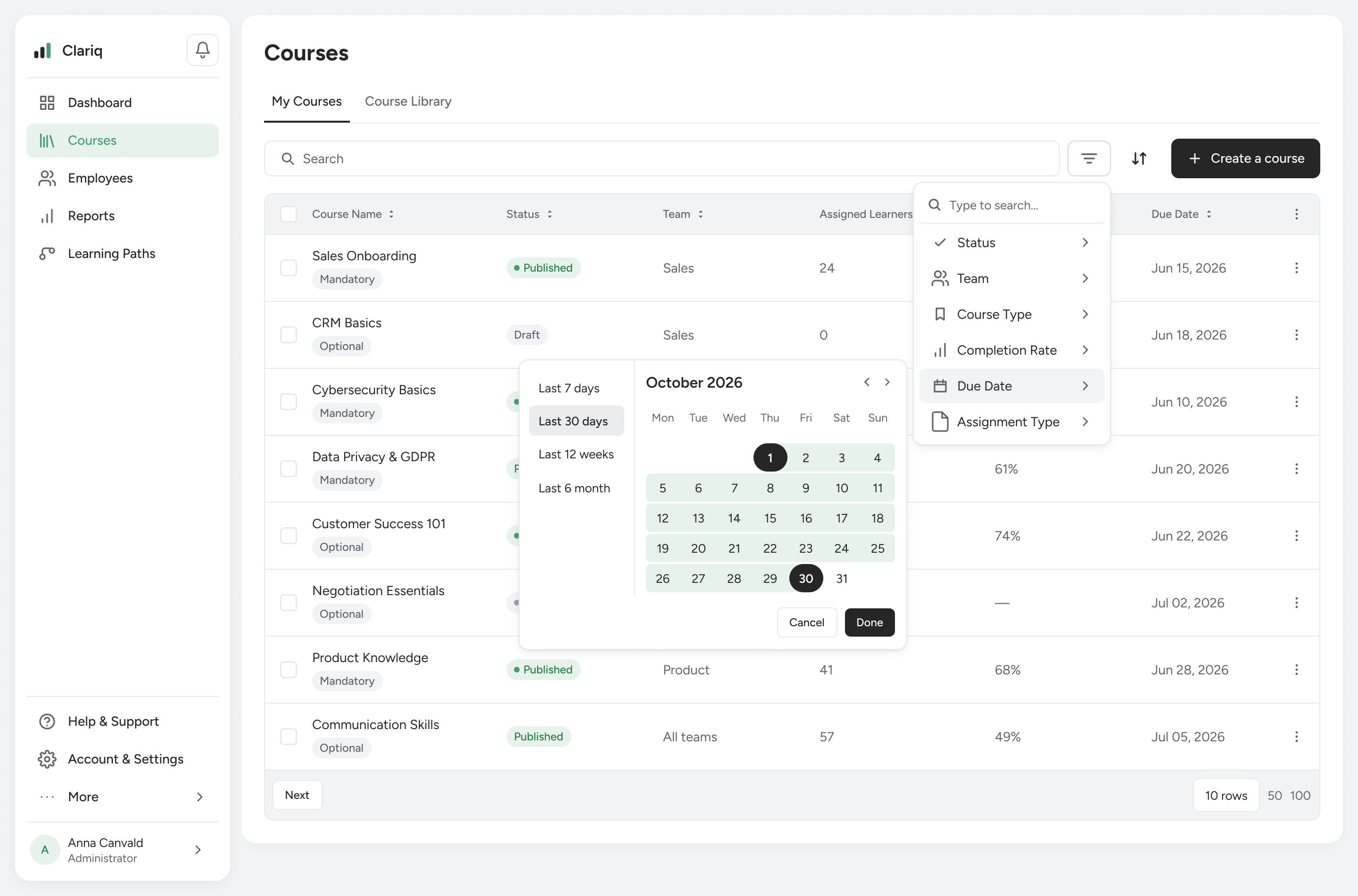
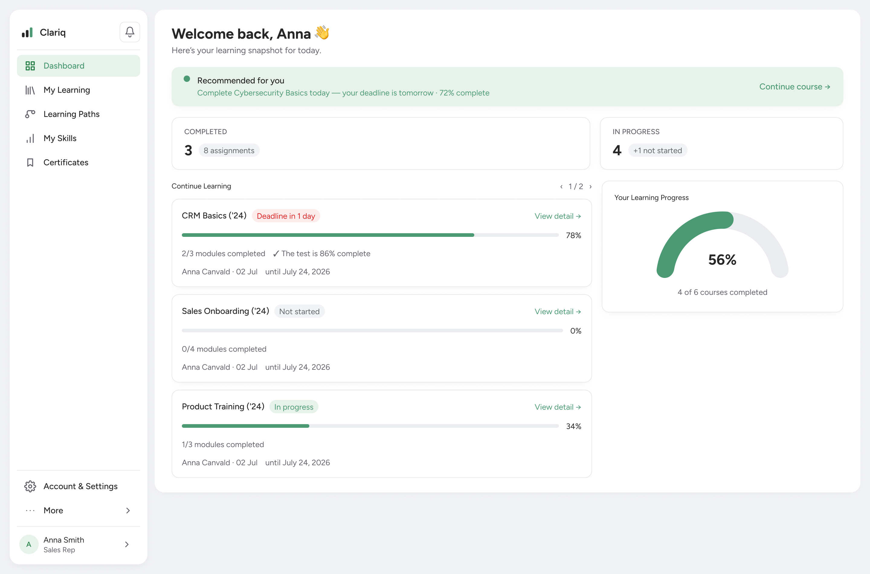
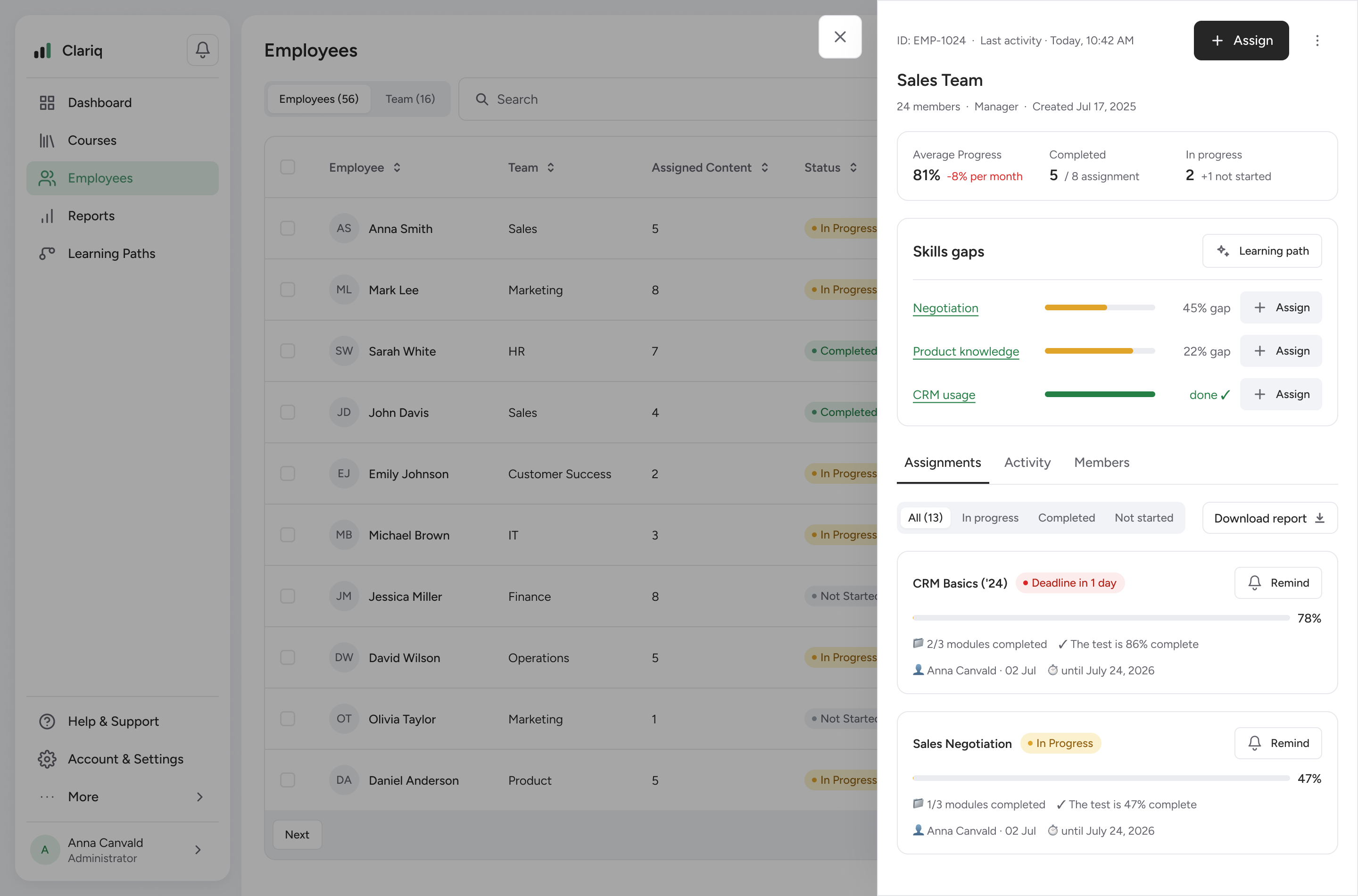
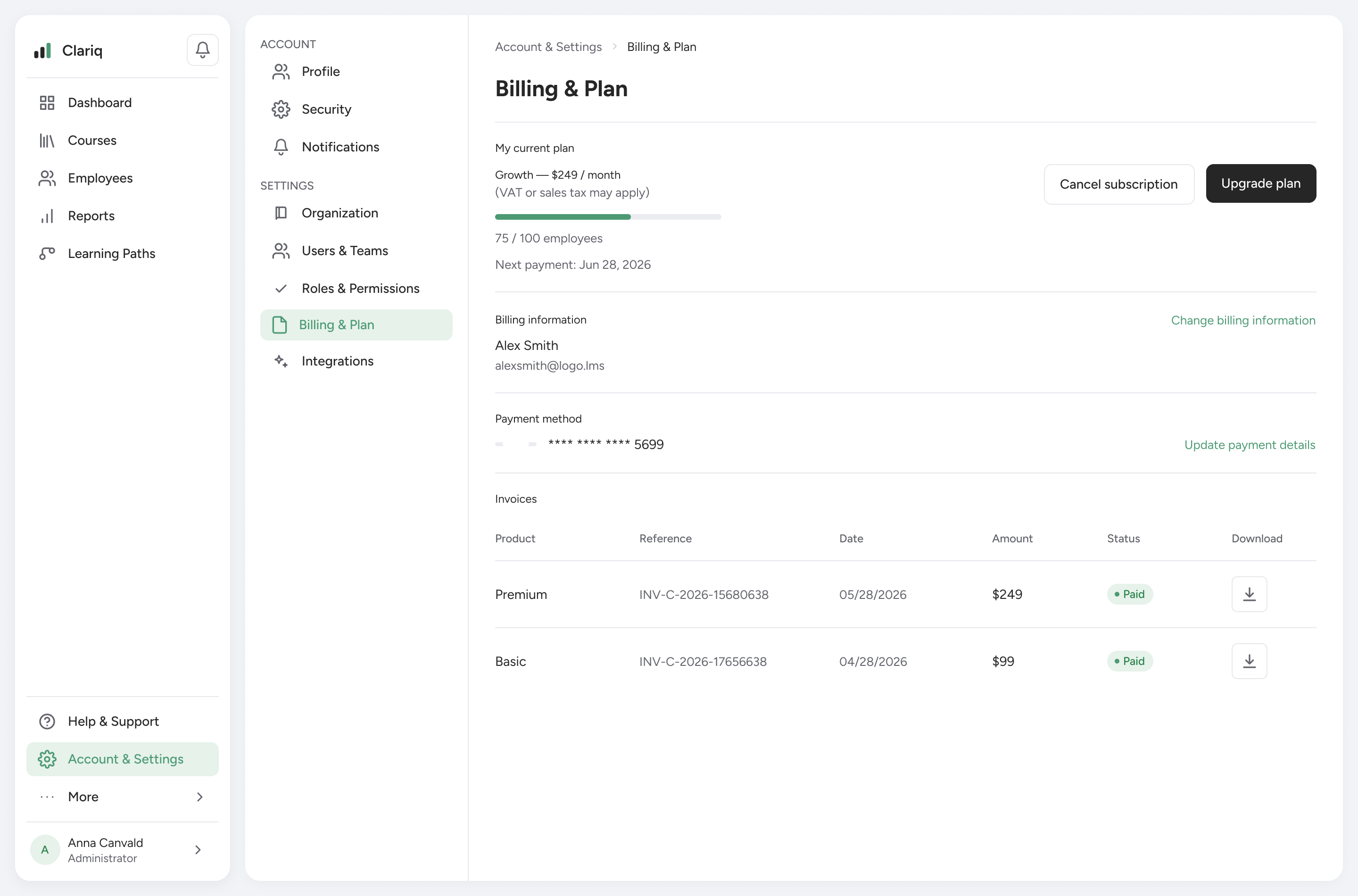
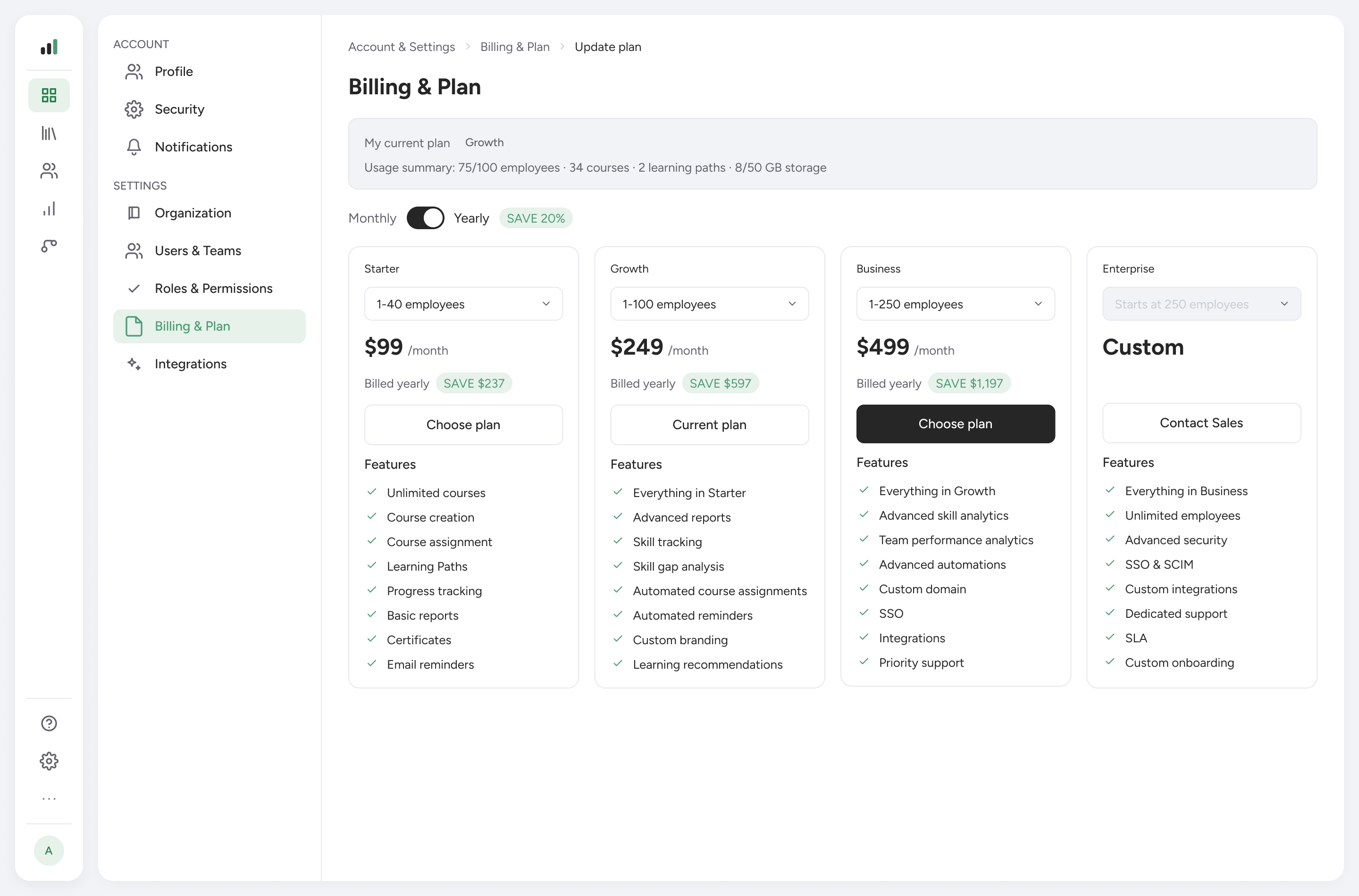
The redesign answers the three management problems: it centralizes learning in one place, makes progress transparent and controllable across teams, and turns skills into something you can see — gaps, promotion readiness and where to develop people next.
It's a concept product, so the design is validated against usability findings, not business metrics.